Patio – Innovation & Startup Campus
7 August, 2024
Better Beauty Innolab by L’Oreal
13 August, 2024Dida Travel
Driven by Tech, Powered by People
New Branding for Dida Travel
Welcome to the new era of Dida Travel! Jorge Aleix Creative Design is proud to have collaborated in the development of the new branding for this recognized company, bringing creativity, strategy, and design to highlight its unique identity in the global market.
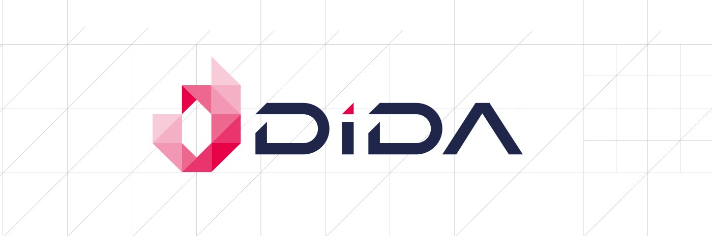
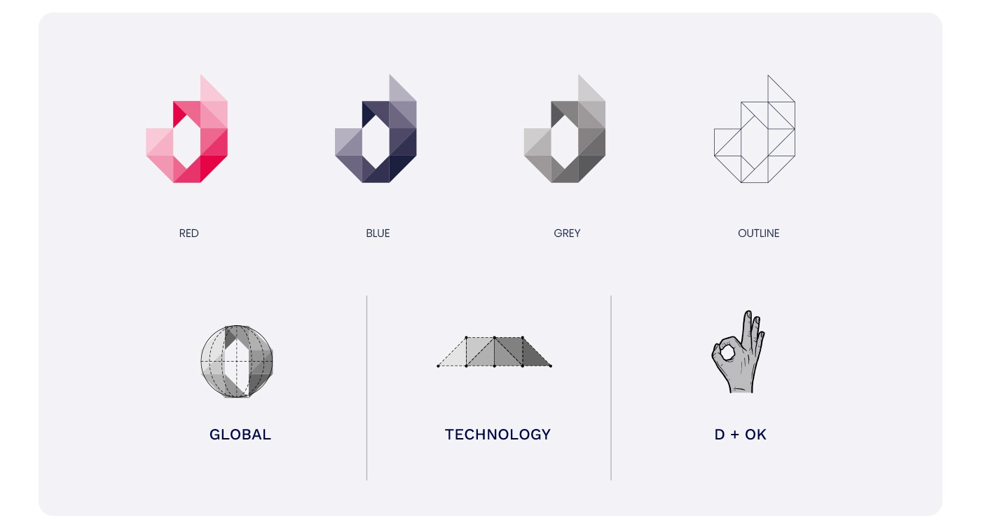
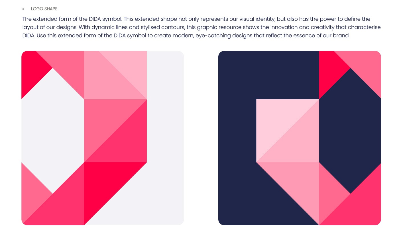
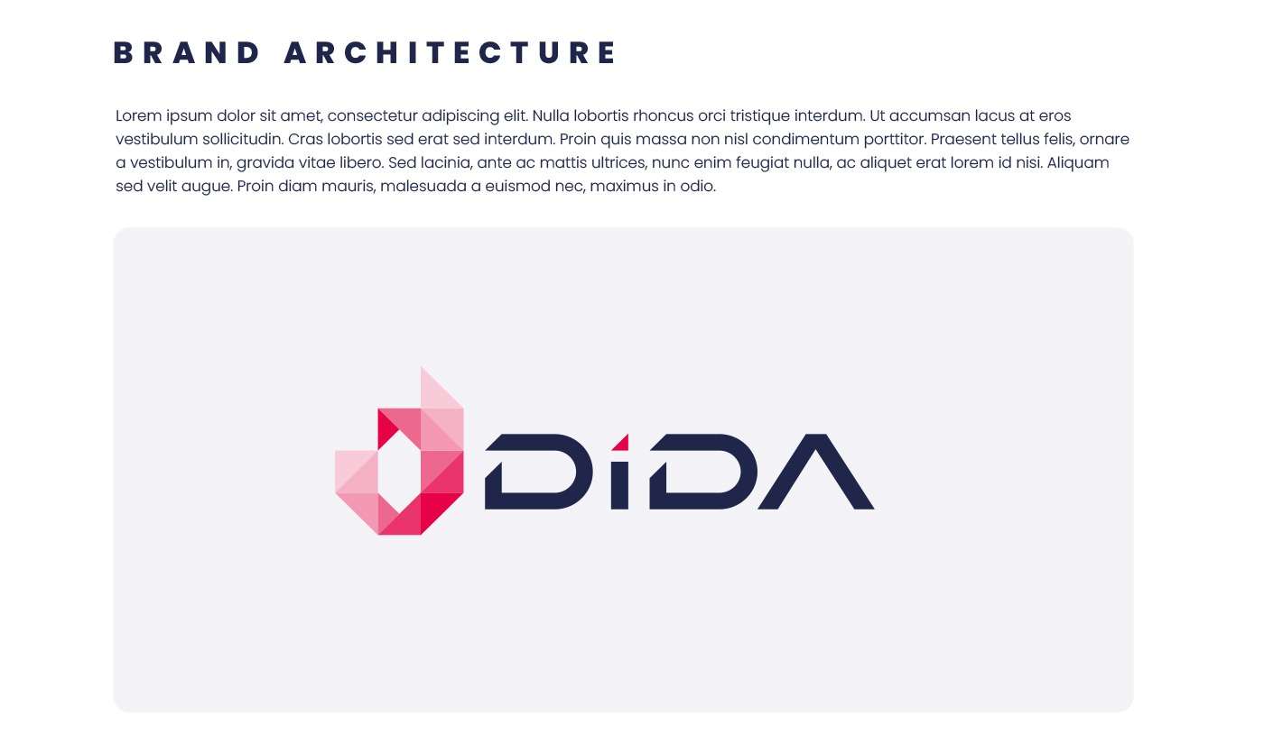
The Symbol of the New Branding
The new symbol of Dida Travel combines three key concepts:
- Globality: Reflecting the international connection that characterizes the brand.
- Technology: Representing innovation and modernity in every aspect of its services.
- The Letter D: With a shape that evokes the "OK" gesture, symbolizing trust and success.
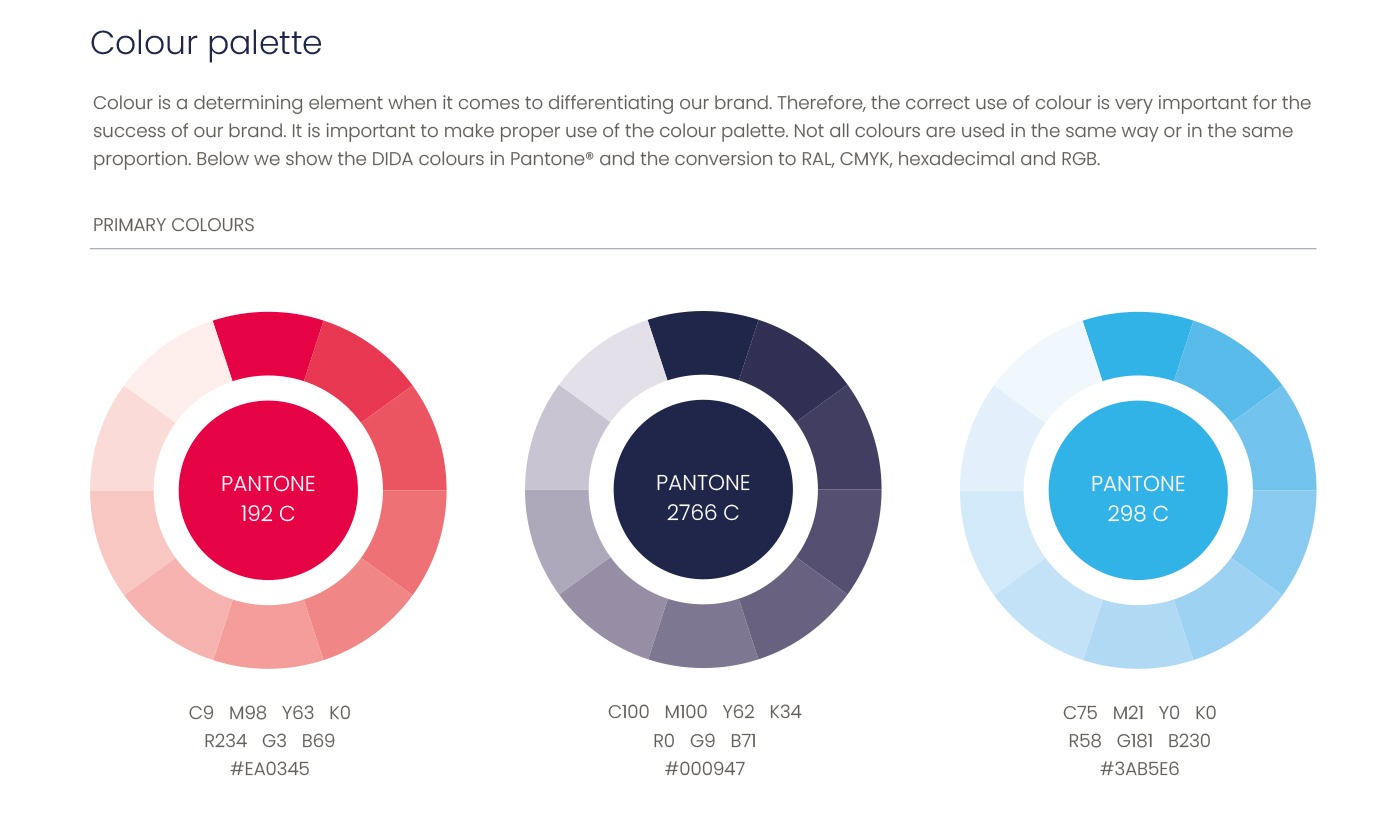
Additionally, we have worked with a palette of red tones, a color deeply significant in Chinese culture, symbolizing good luck, prosperity, and positive energy.
A Comprehensive Corporate Identity Manual
To ensure the consistency and longevity of the new branding, we have developed a detailed Corporate Identity Manual that includes:
- THE BRAND
- Positioning, slogan, and vision that define the purpose and values of Dida Travel.
- A deep analysis of the brand's mission and principles.
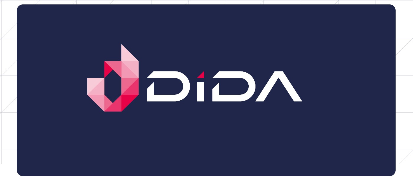
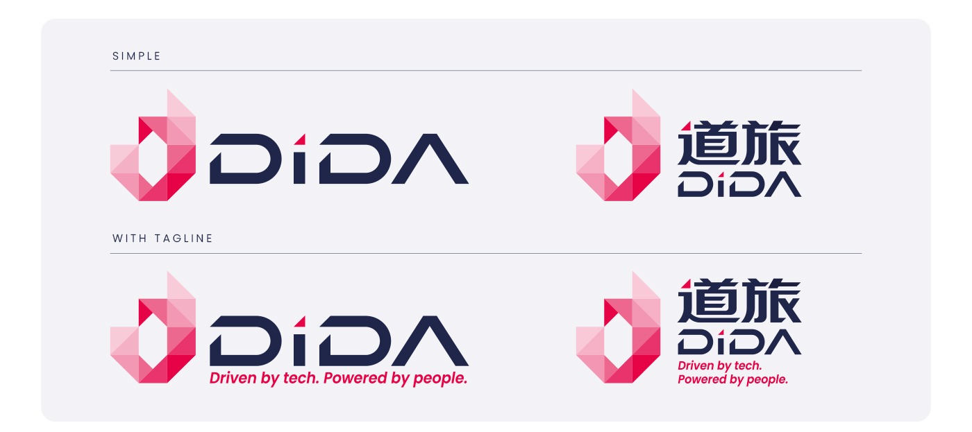
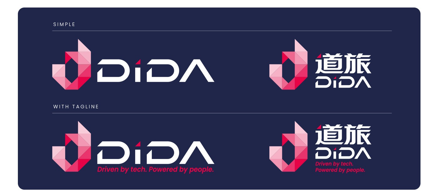
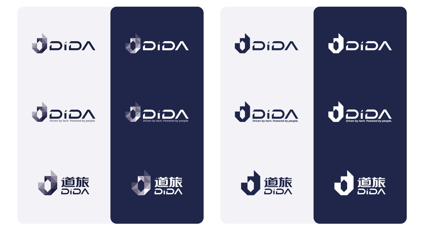
- LOGO
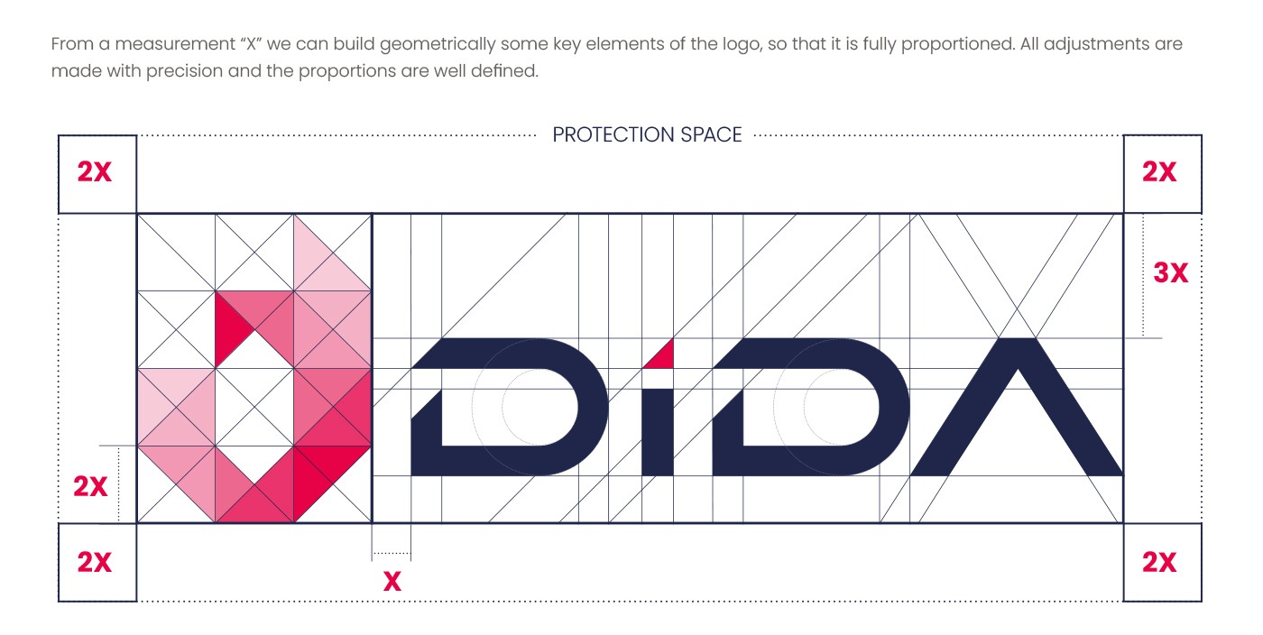
- Primary, secondary, and variations of the logo.
- Usage guidelines and a clear outline of its protection space.
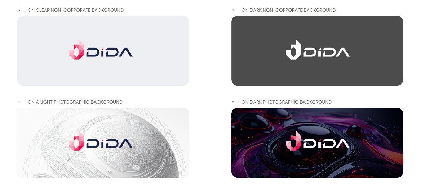
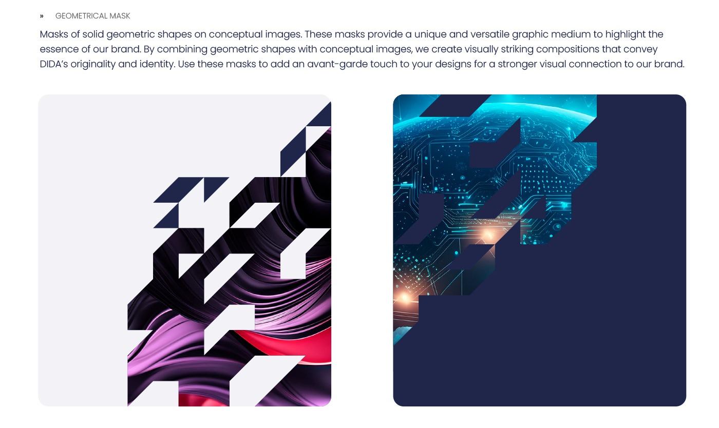
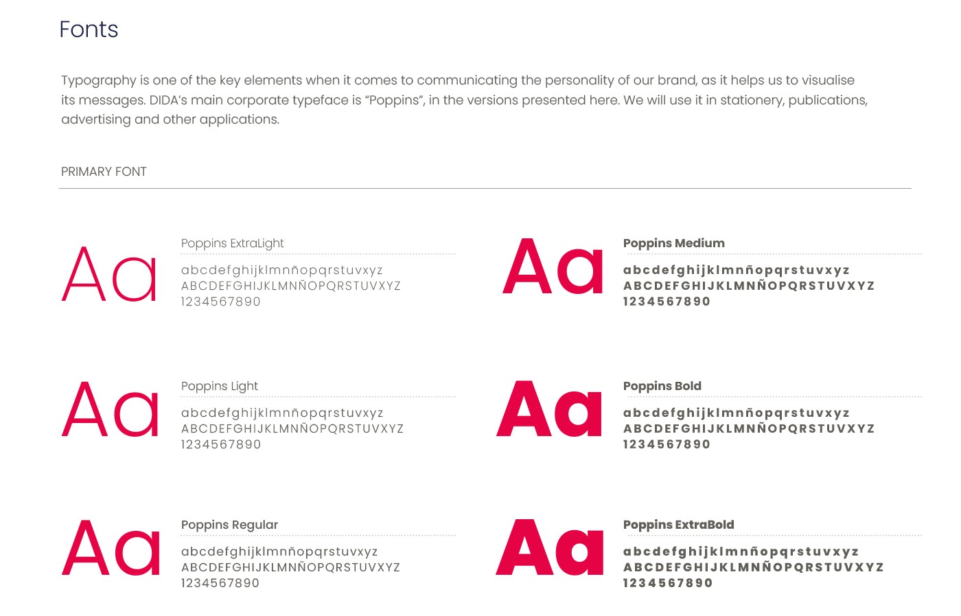
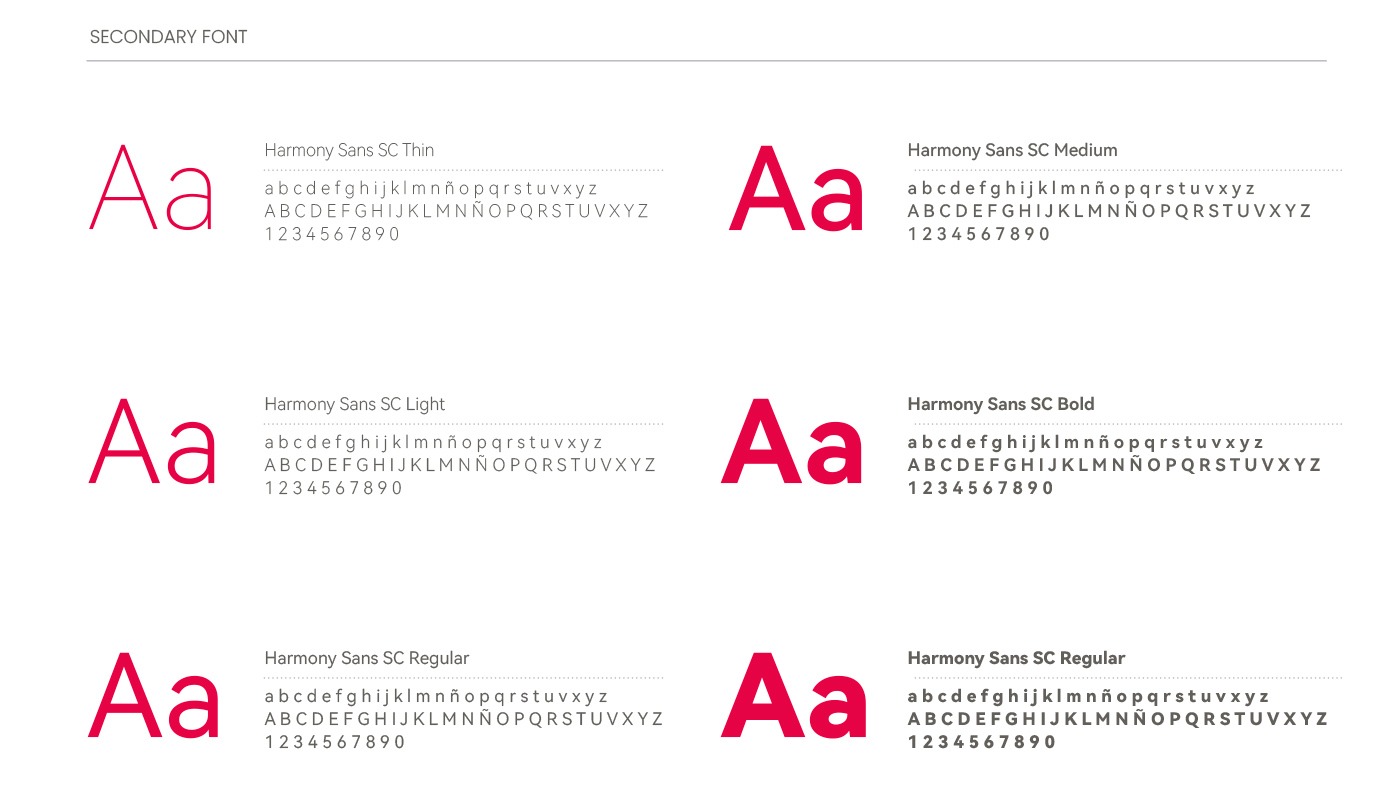
- VISUAL STYLE
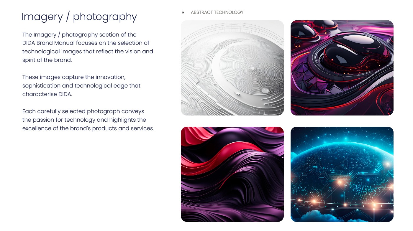
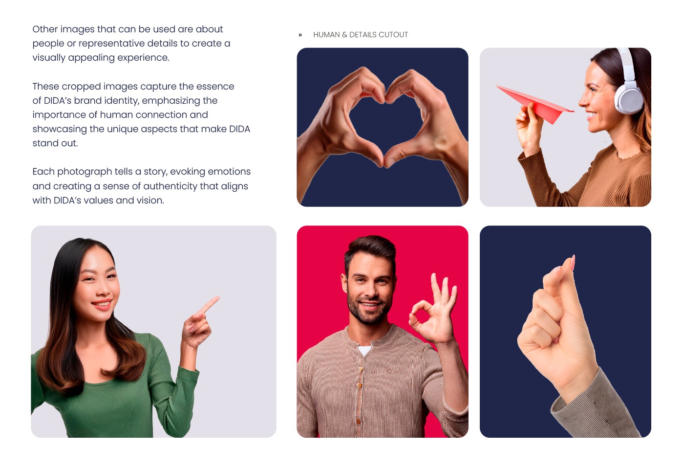
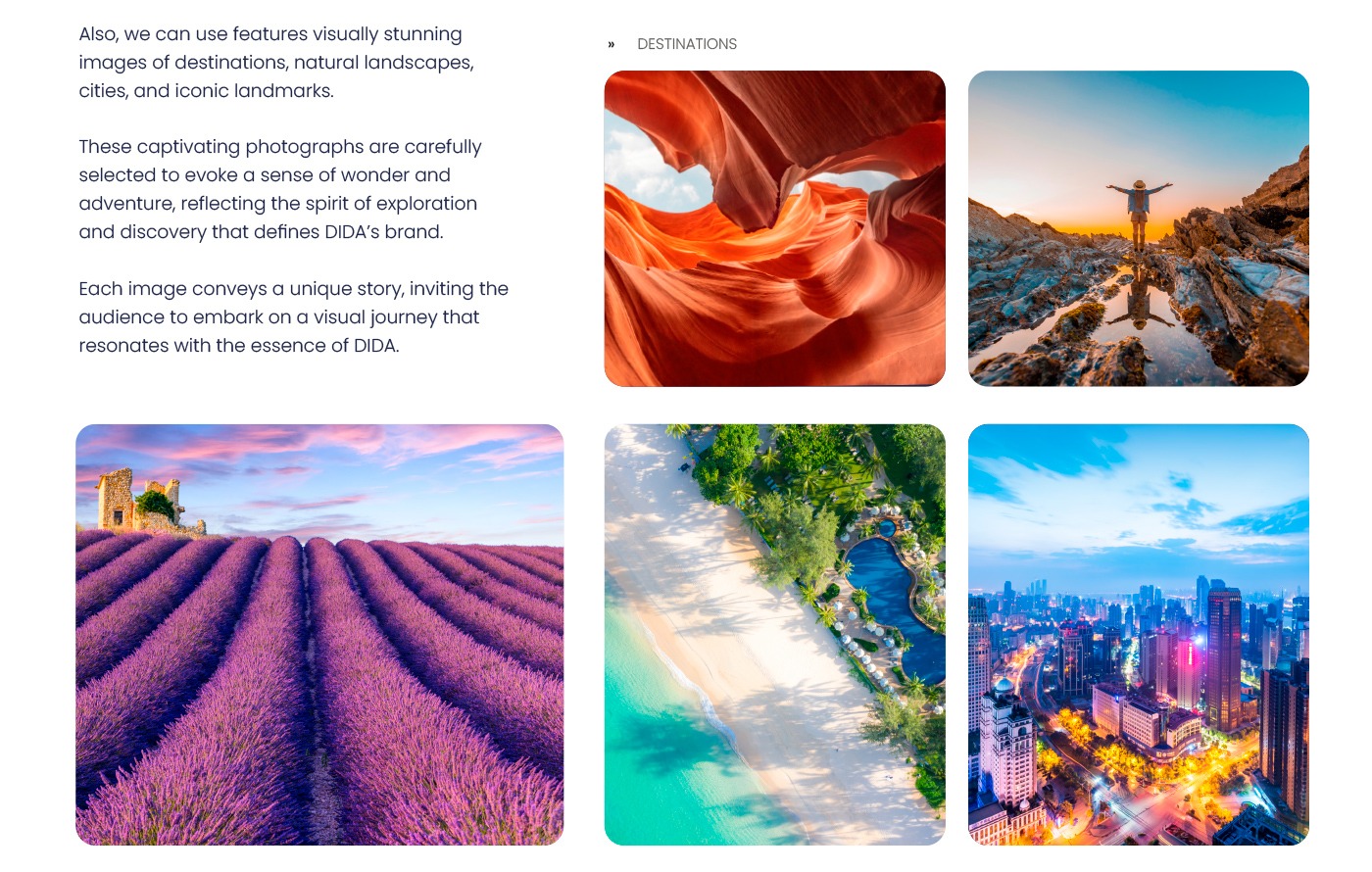
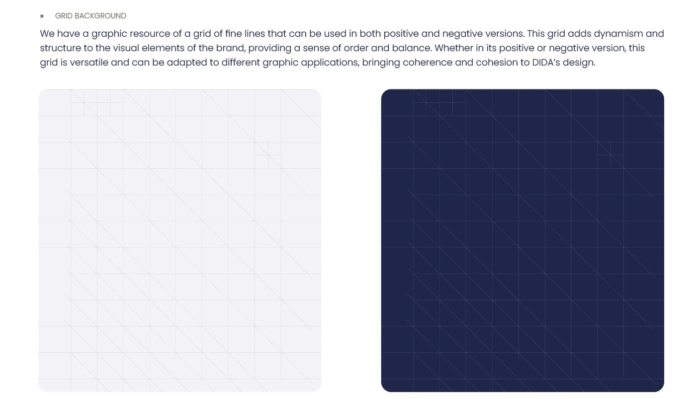
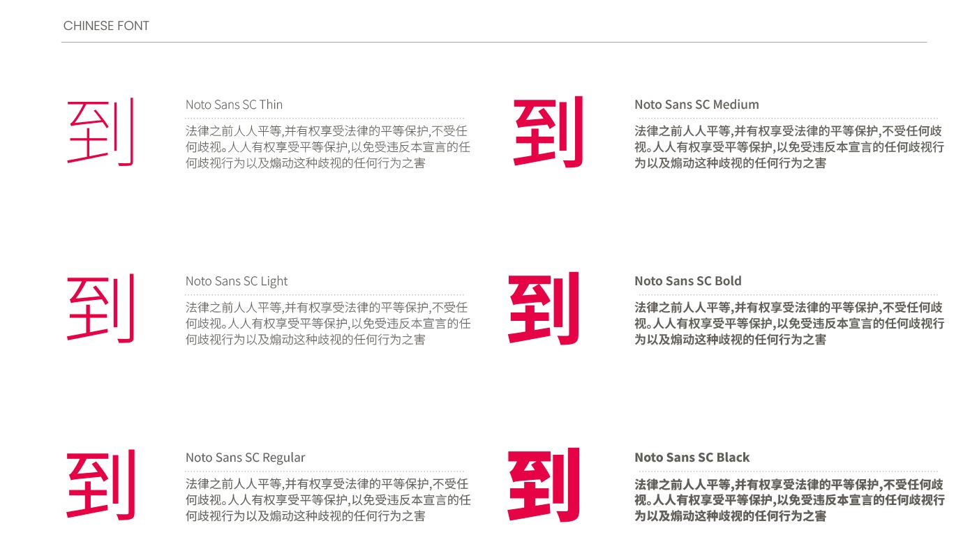
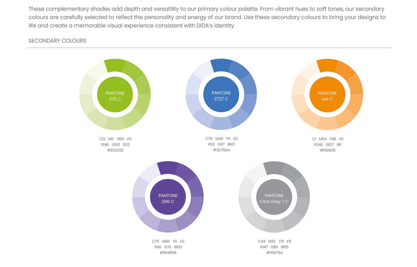
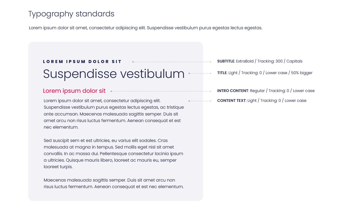
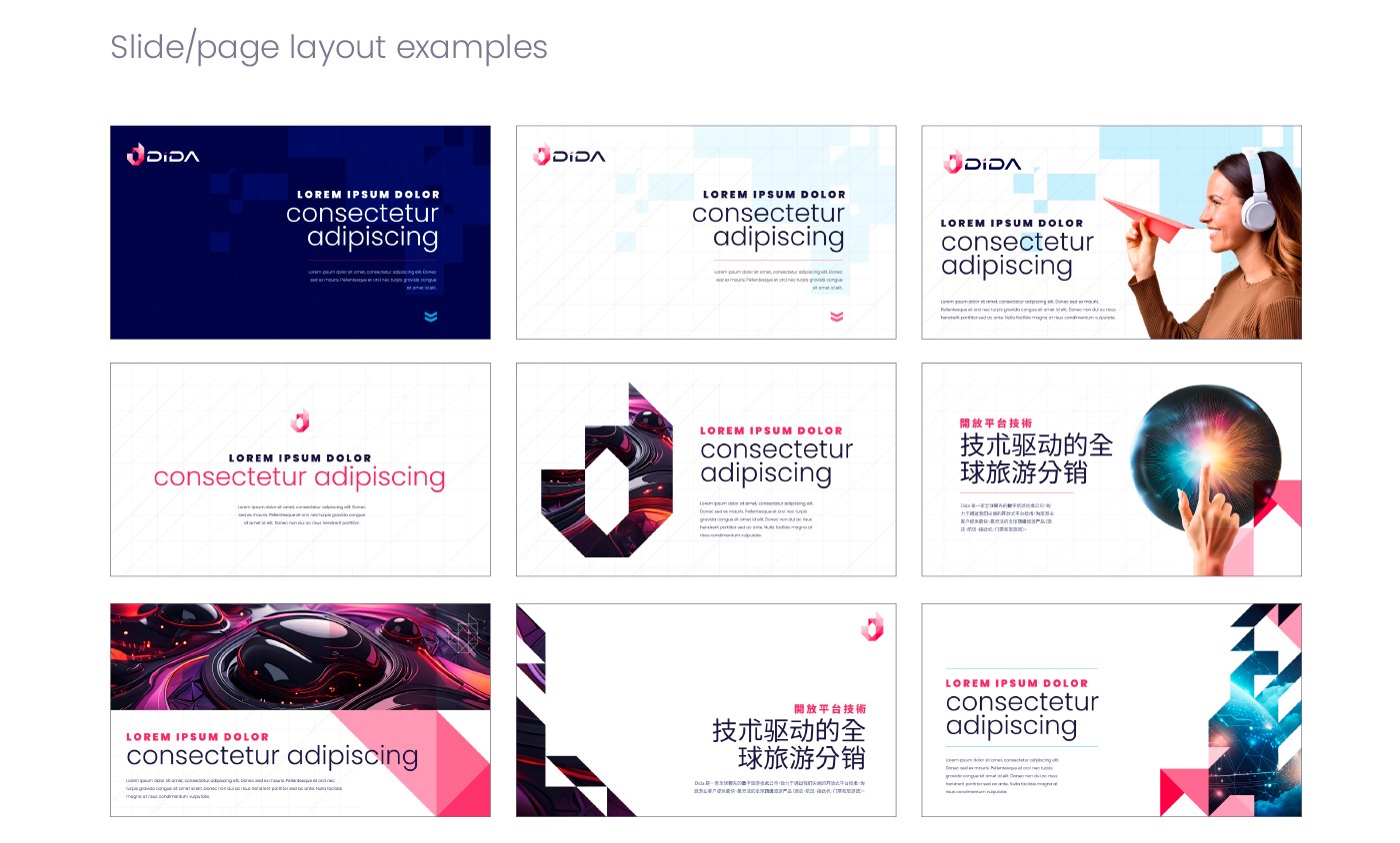
- Visual elements such as photography, color palette, and typography.
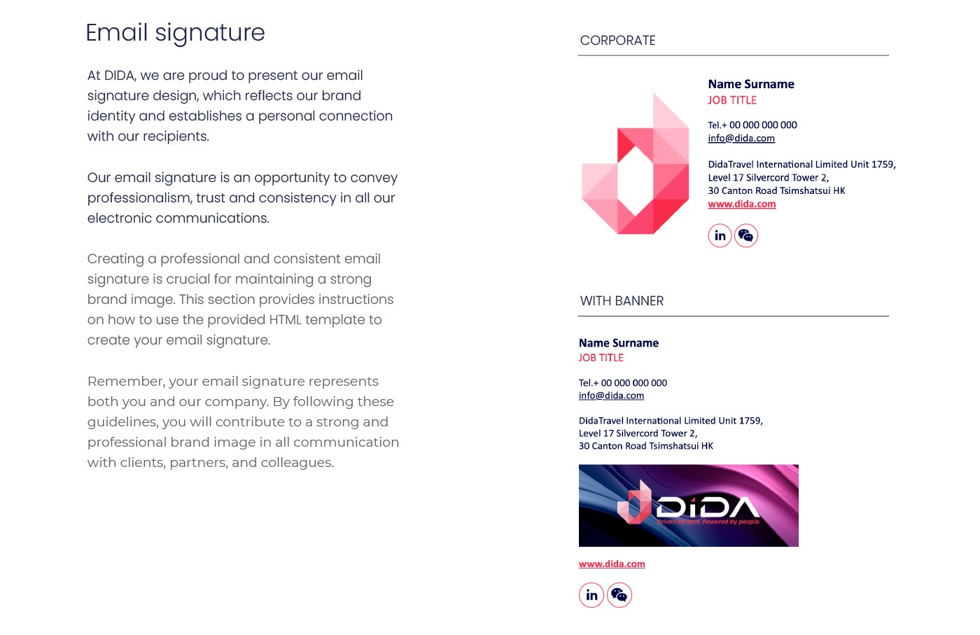
- Examples of layouts, promotional emails, and UI design guidelines.
- APPLICATIONS
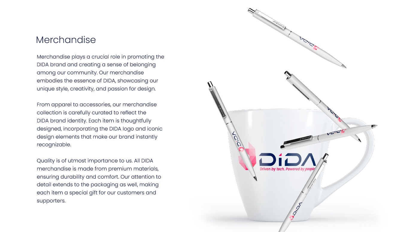
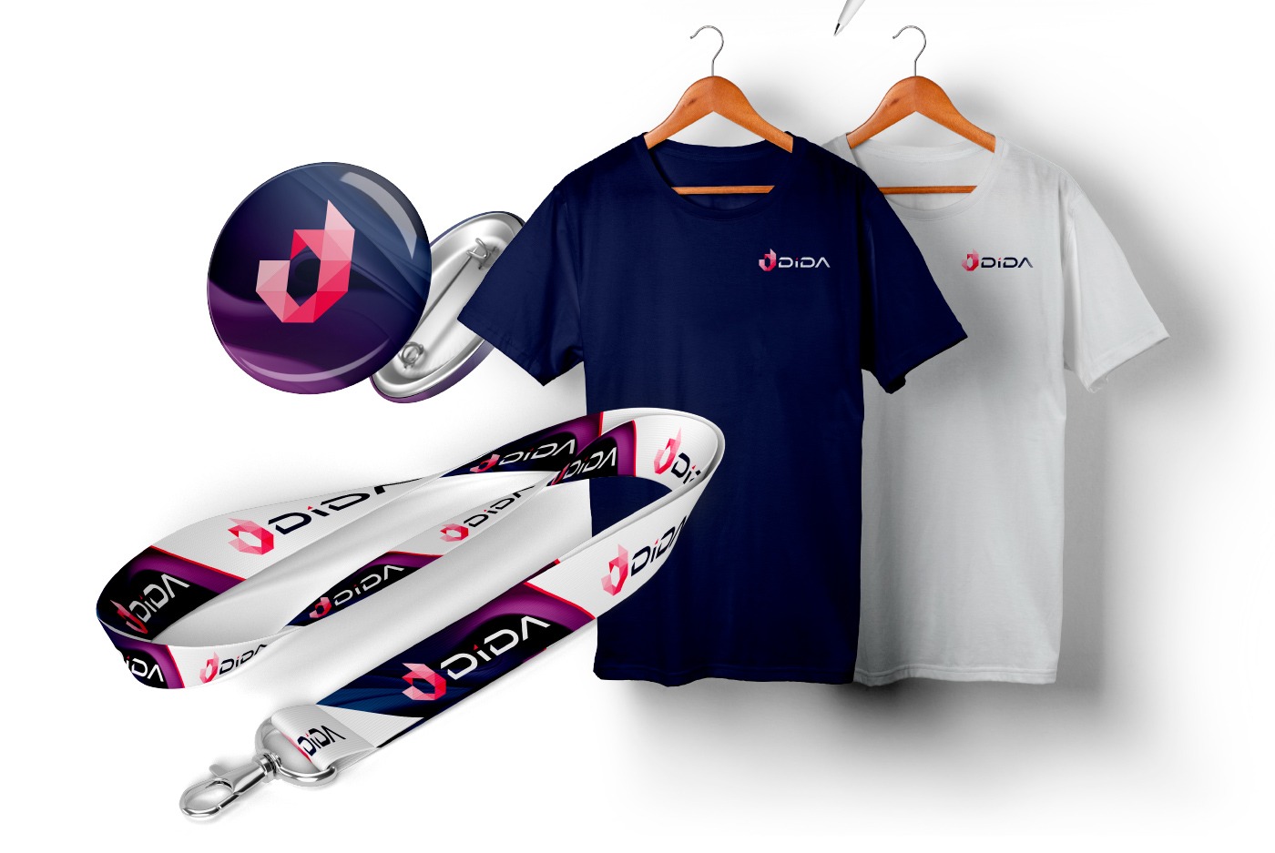
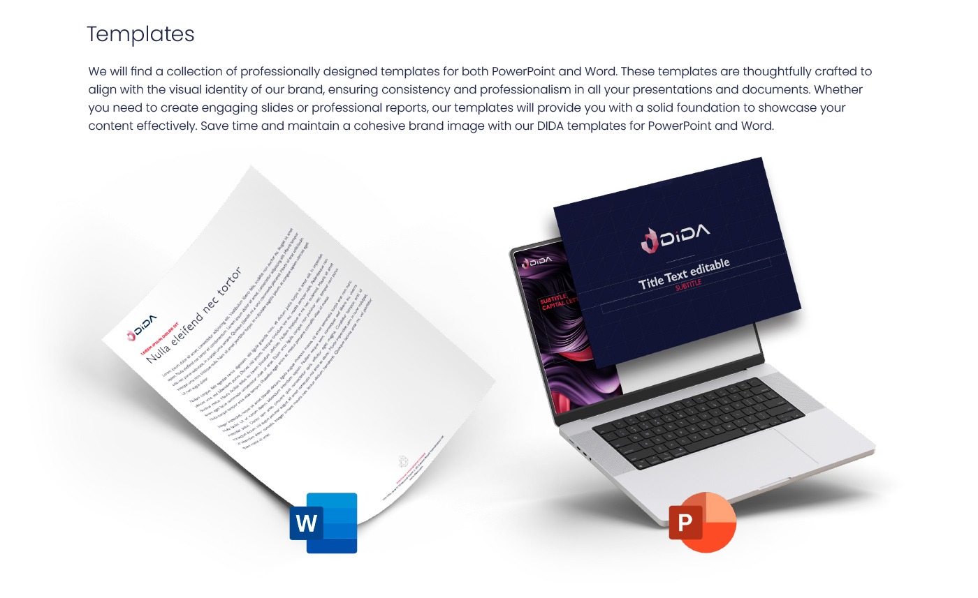
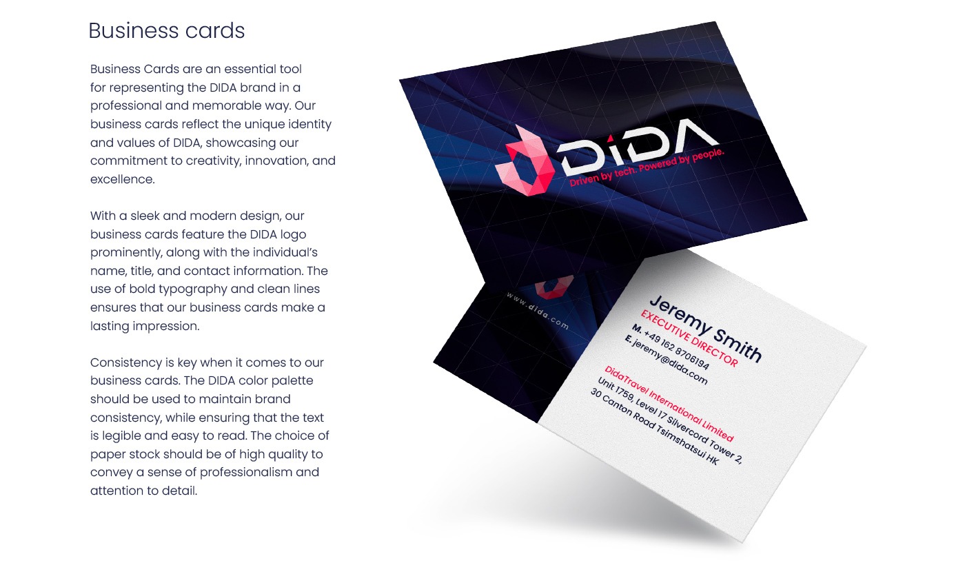
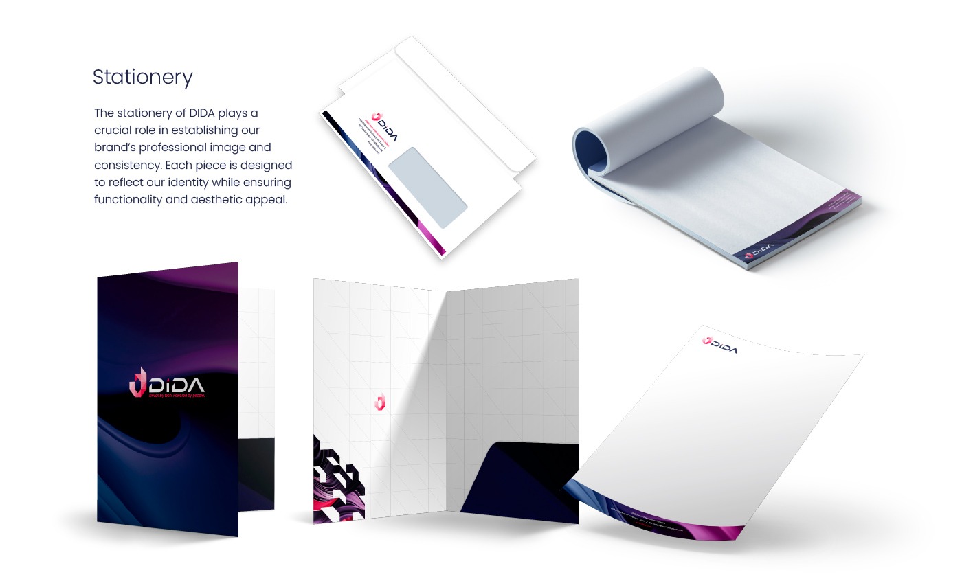
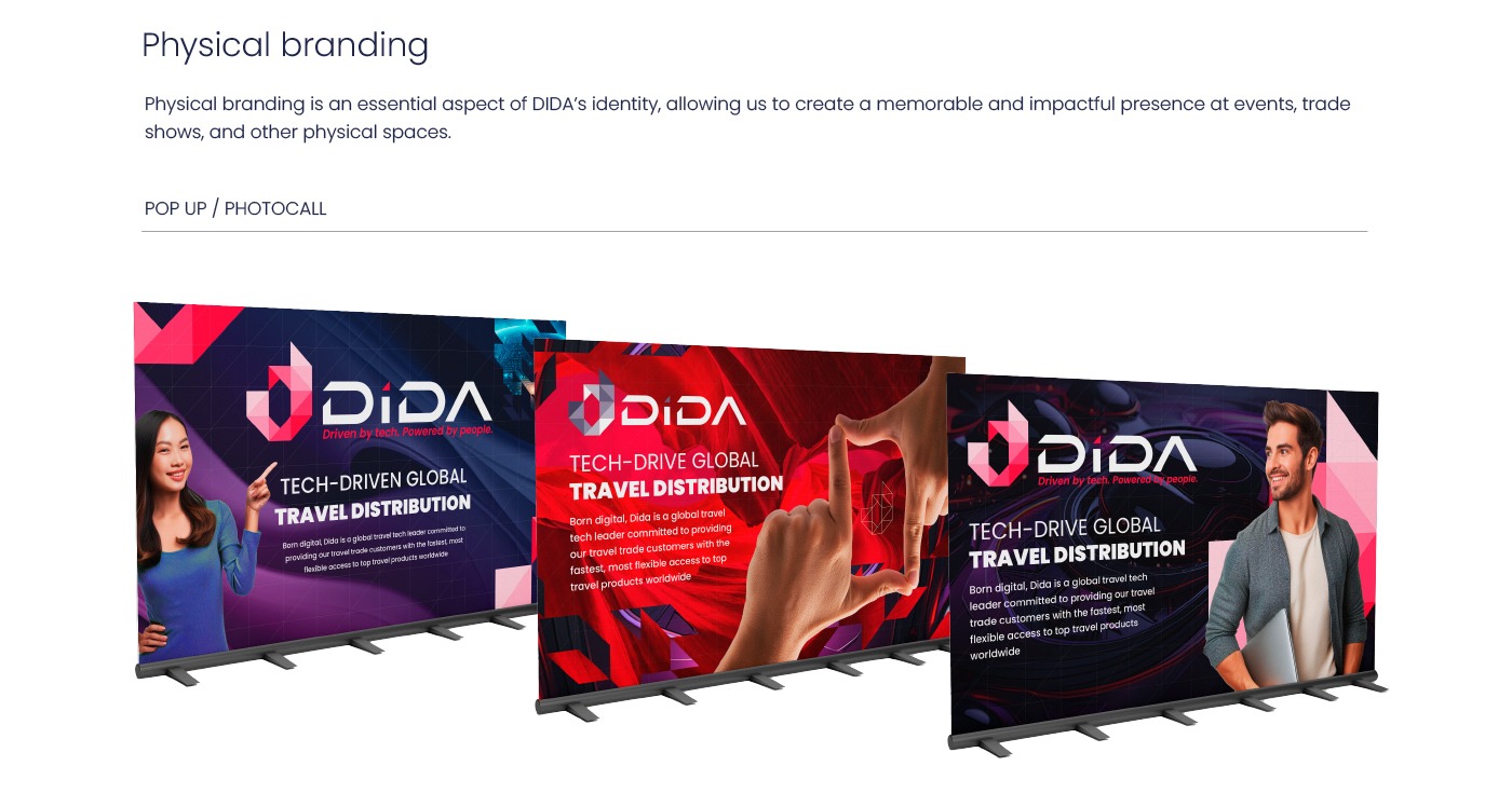
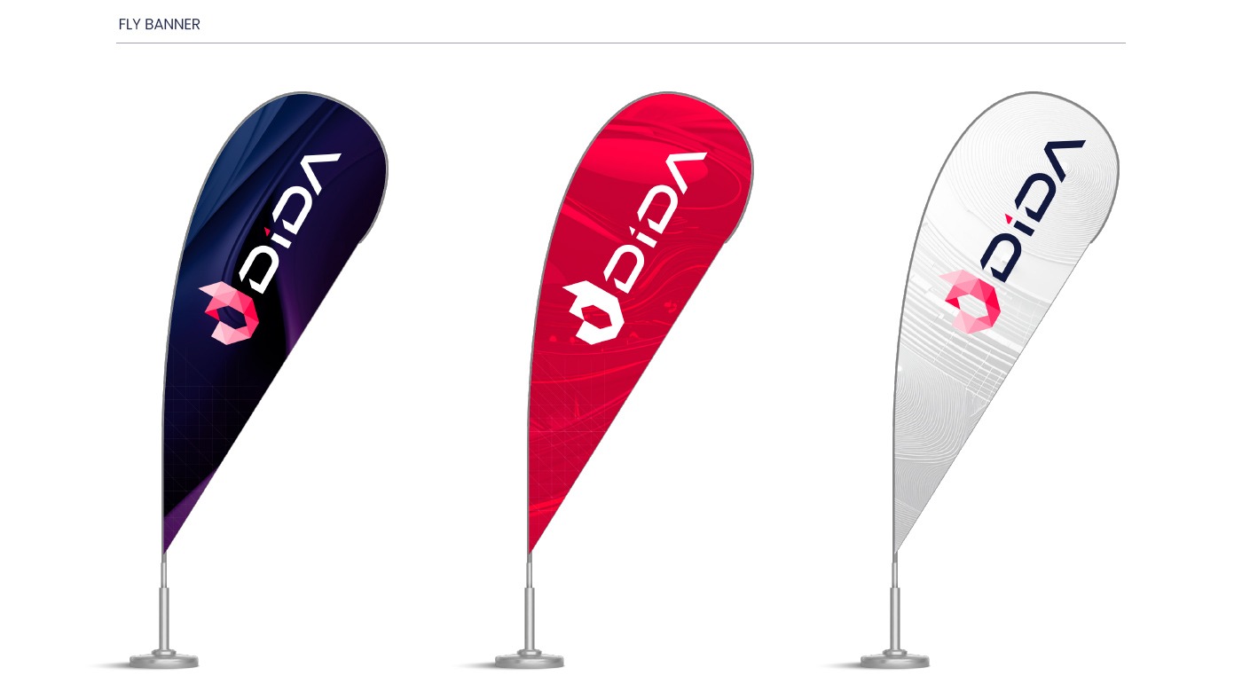
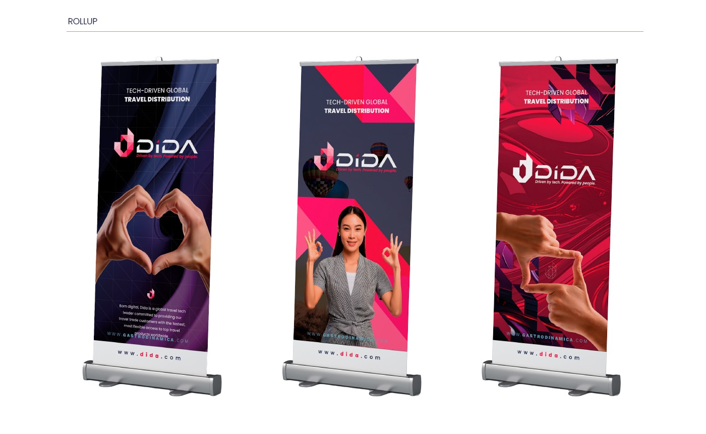
- Designs applied to merchandising, business cards, templates, and more.
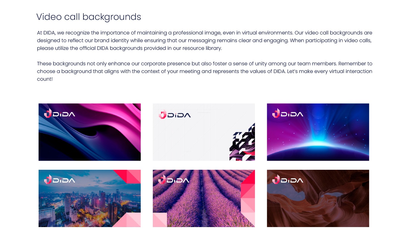
- Resources such as backgrounds for video calls and physical branding for fairs.
- TONE OF VOICE
- Development of a coherent and professional language for all communications.
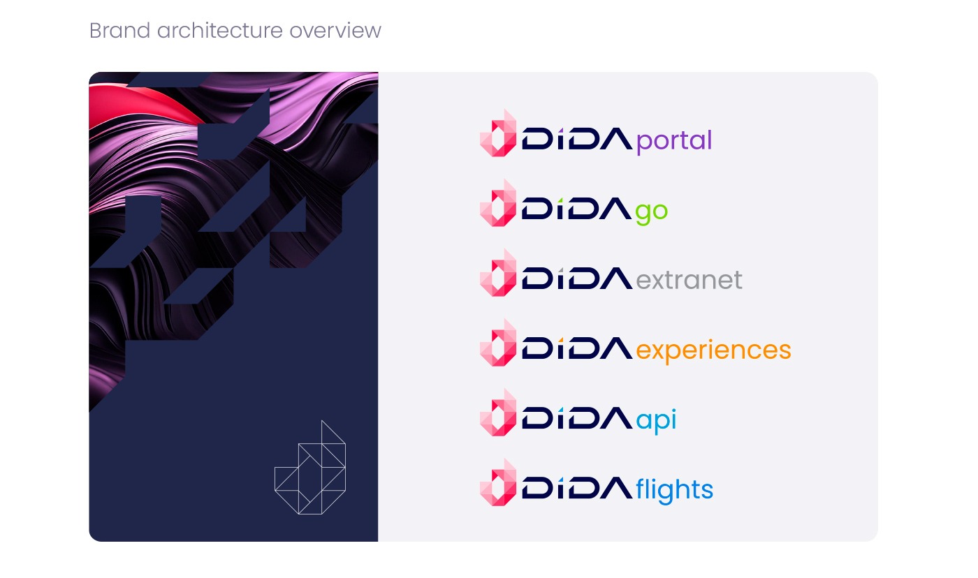
- BRAND ARCHITECTURE
- Brand structure and its relationship with product lines, as well as FAQs.
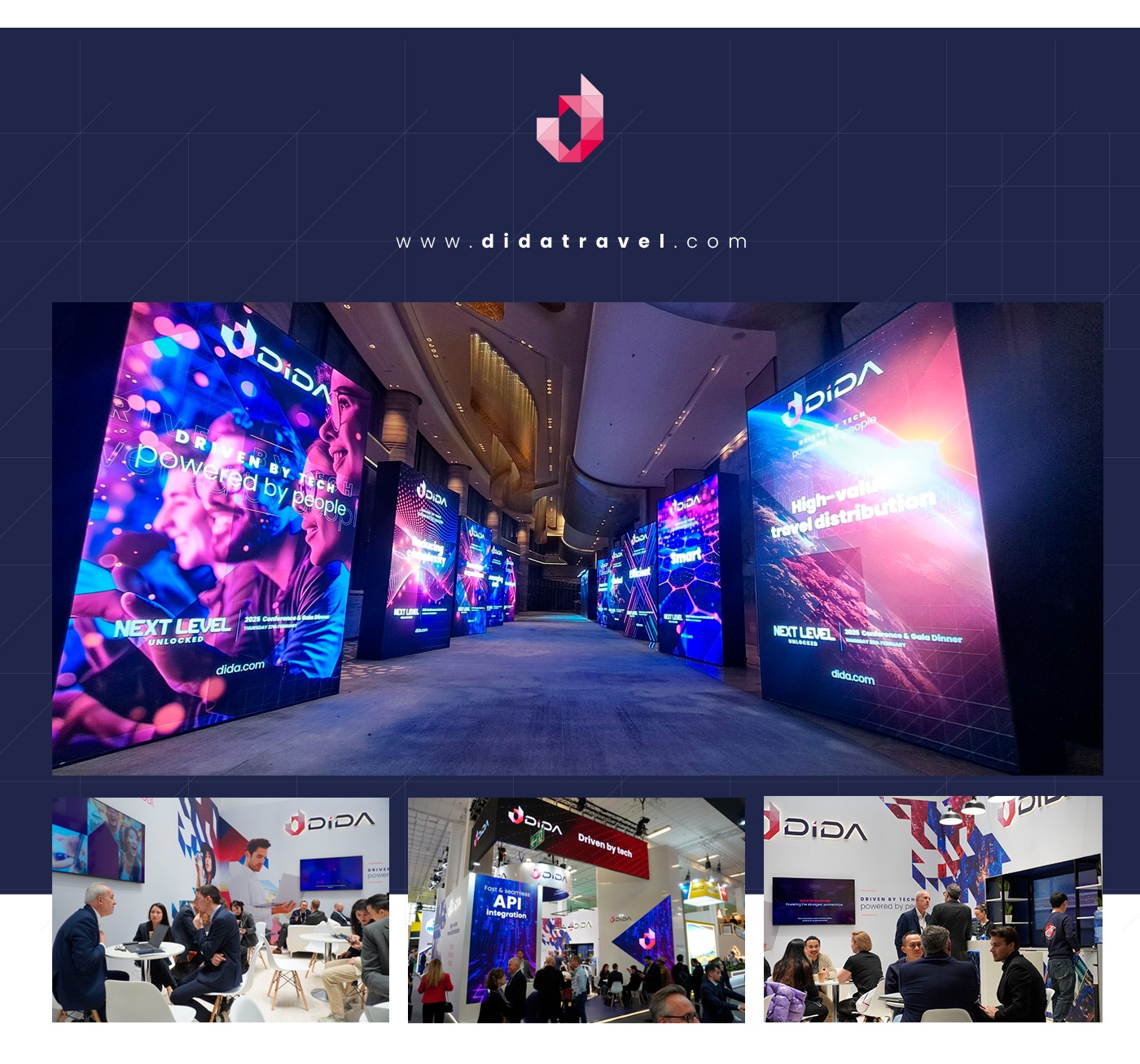
Featured Projects
In this collaboration, Jorge Aleix Creative Design also worked on the stand design for Dida Travel at two of the most important tourism fairs in the world:
- ITB Berlin
- WTM LATAM
These stands reflect the new branding of the brand, highlighting its modernity and professionalism in a competitive environment.
A Branding that Connects with the World
The work done for Dida Travel not only seeks to represent its essence but also to position it as a leader in the global tourism sector. From conceptual development to implementation, this new branding is a testament to how strategic design can transform and elevate a brand.Discover more about this project and others at Jorge Aleix Creative Design!
Explore more projects