Alejandro Vizcarro
3 March, 2018
Es Pí
30 March, 2018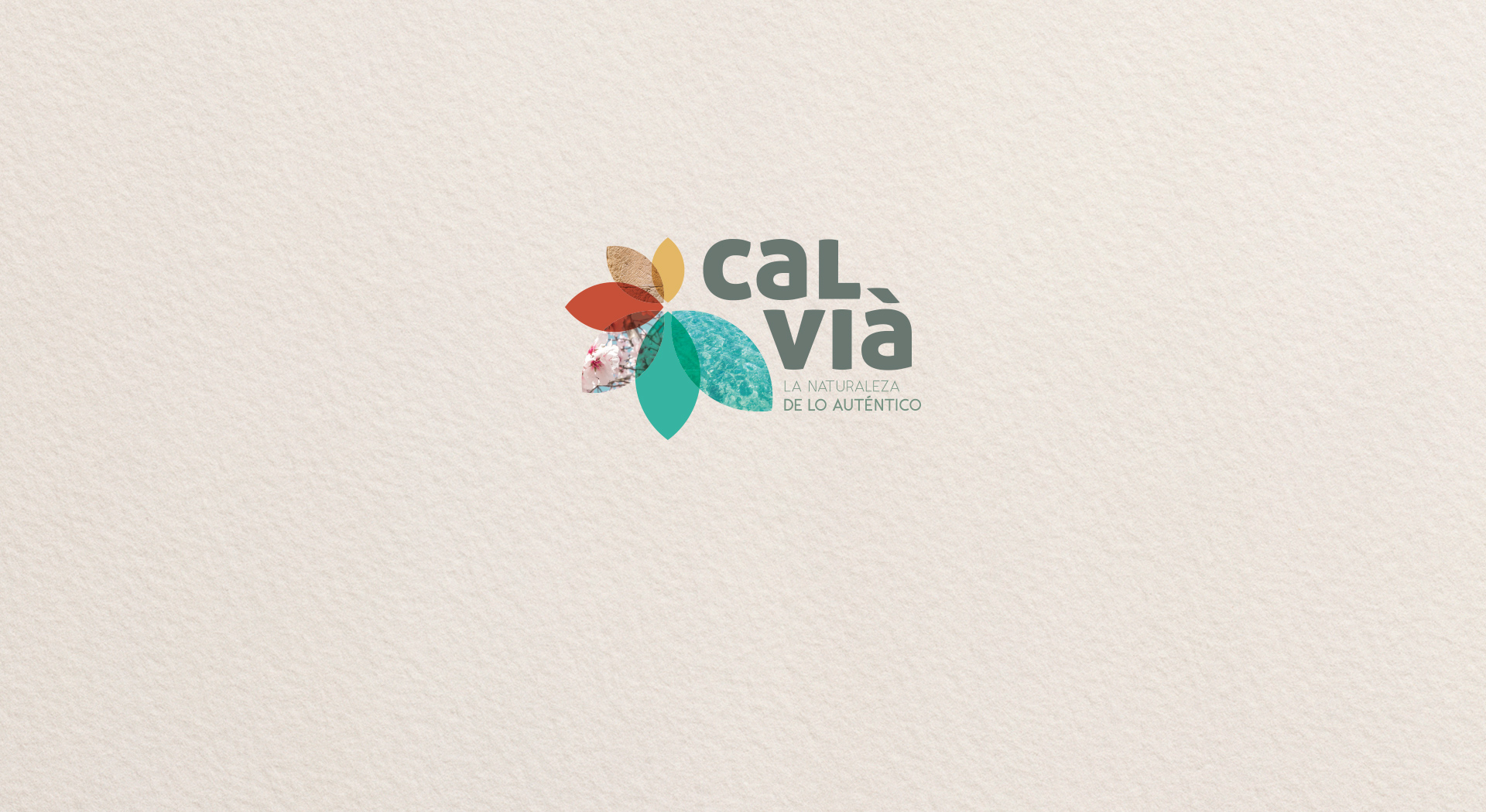
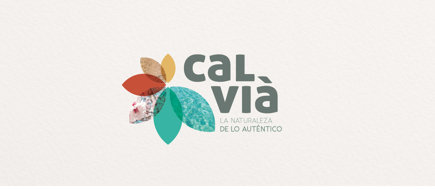
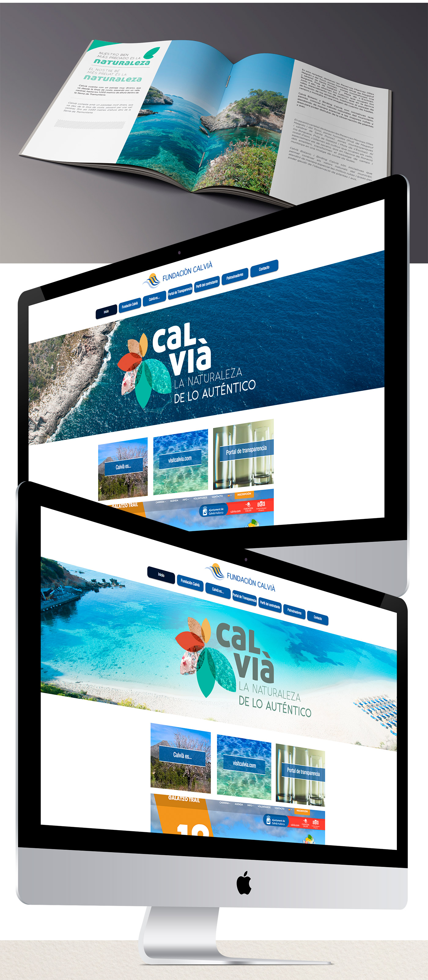
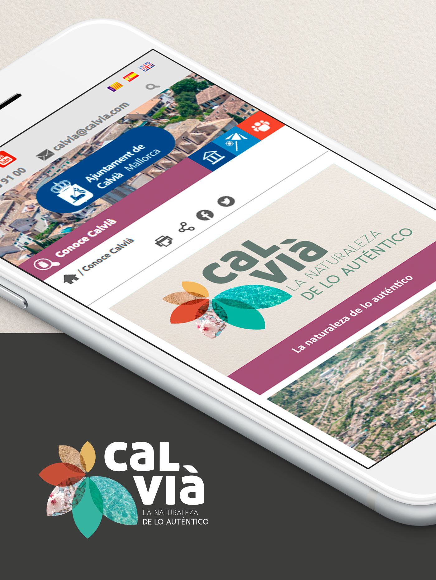
Calvià
La naturaleza de lo auténtico
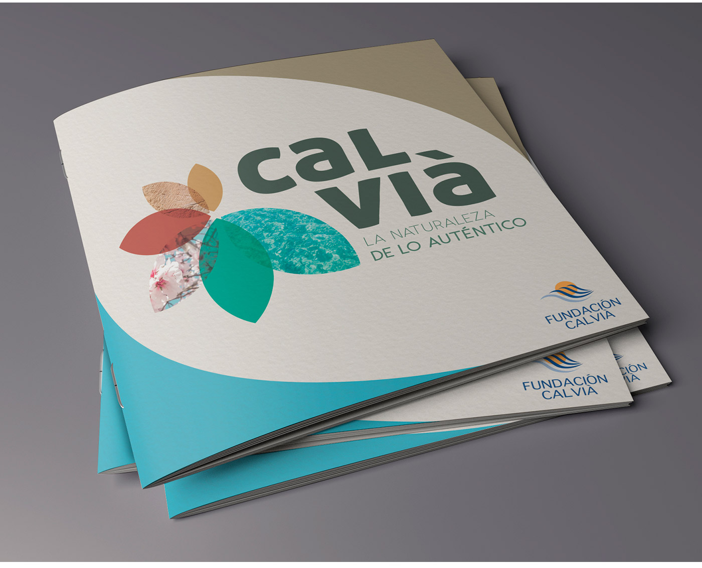
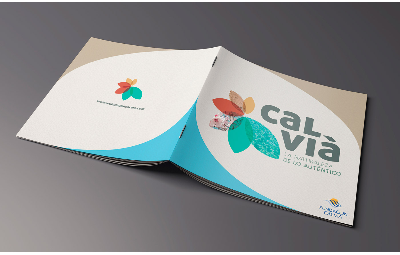
Proposal for a logo, slogan and brochure design to attract tourism to the municipality of Calvià.
This proposal represents the values that the land of Calvià can offer. A very close and relaxing proposal that mixes the shape of a flower making reference to nature. The inside of each petal contains each of the big ones.
It is a simple image but with a great meaning inside it. With the division of the name into two lines, we achieve a compact and unique whole for a greater impact.
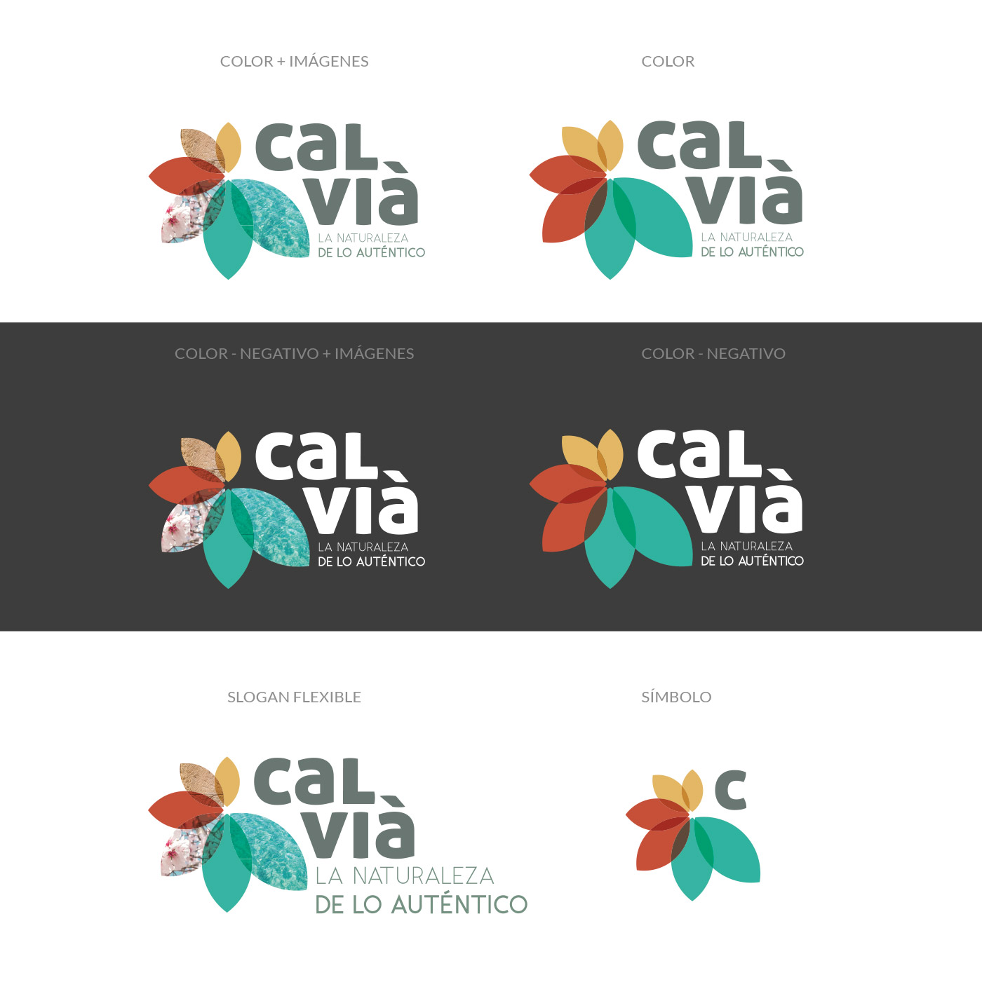
The colours represent sensations that you can experience in Calvià. We used reduced colours to achieve a relaxing effect when looking at it, and curiosity when looking at the masks of inspirational photographs. Orange - Sand, sea stone, history... Red - Mountain, flowers, countryside... Green - Nature, turquoise water, freshness...
A modern and robust typography gaining visual impact in the main word, combined with the "thin" font used for the slogan, create a game of contrasts to balance the whole.
Its compact appearance gives it versatility in adapting to any medium or format.