LDO Mallorca Real Estate
4 August, 2023
Resitax – Beyond taxation
4 September, 2023MALCRIADES
Born to fry
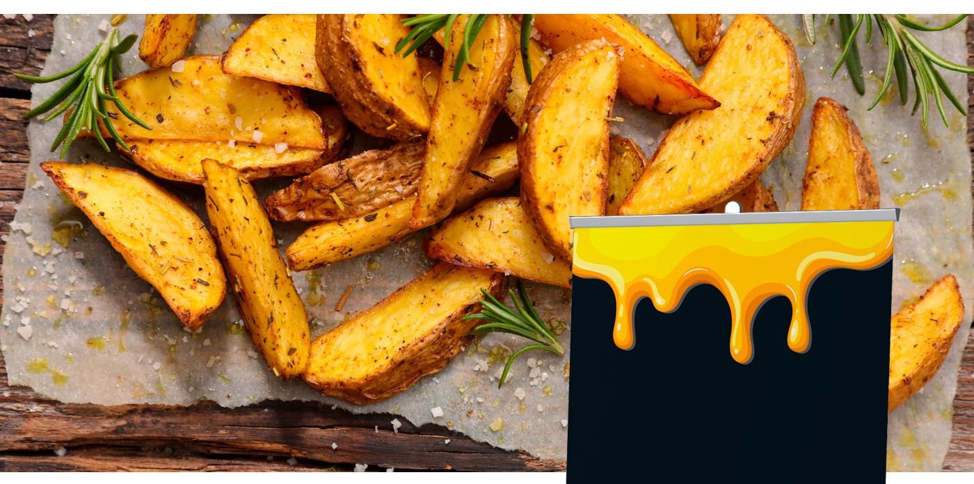
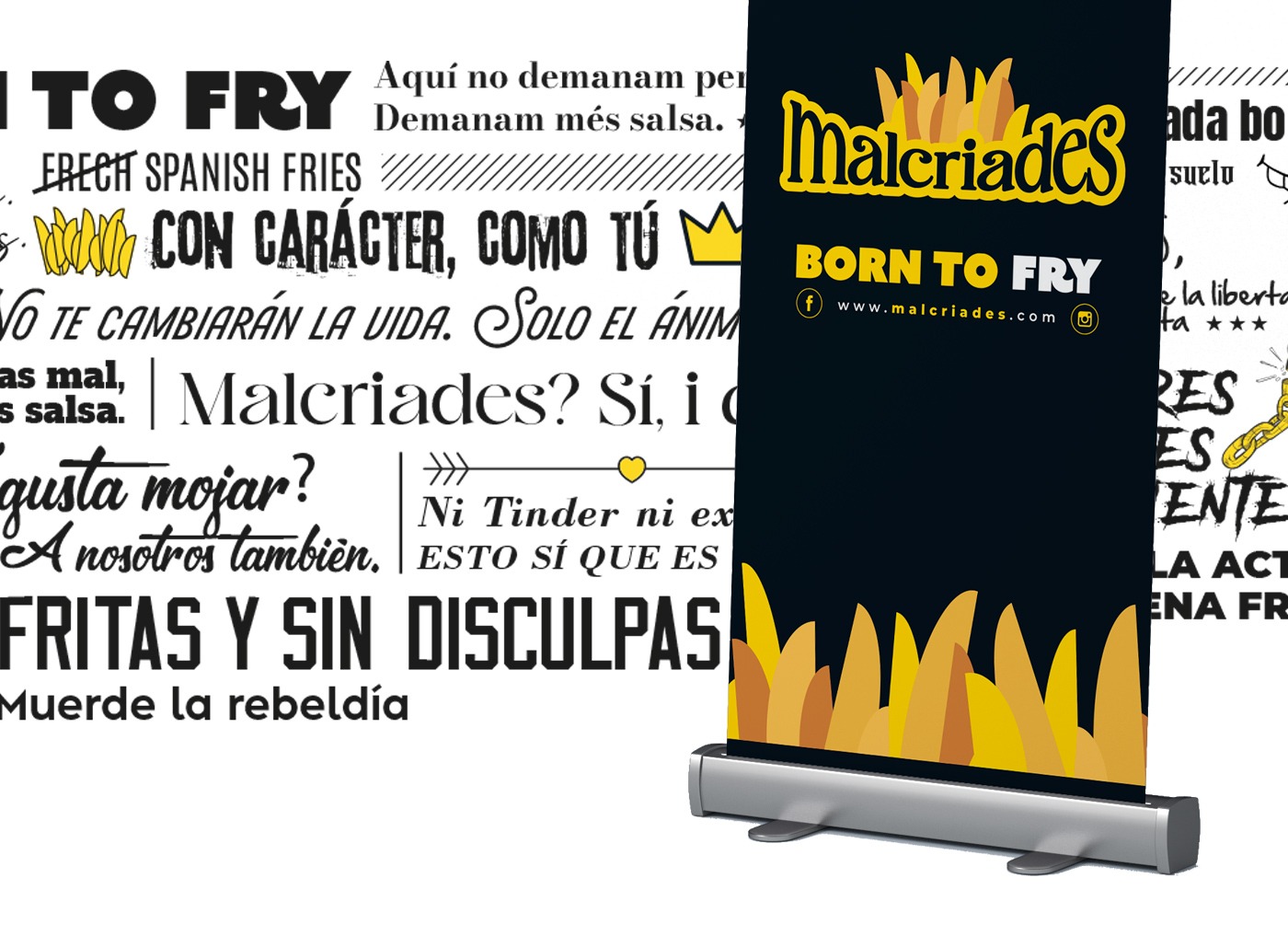
Malcriades: The New Branding That Revolutionizes Foodtrucks for Fries with Cheese
A Unique Design Project Created by Jorge Aleix Creative Design
At Jorge Aleix Creative Design, we are passionate about bringing authentic and memorable brands to life. That’s why we are excited to present our new branding project for Malcriades, a food truck specializing in fries with cheese that delights not only the palate but also the eye.
The Logo: Creativity and Flavor in Every Detail
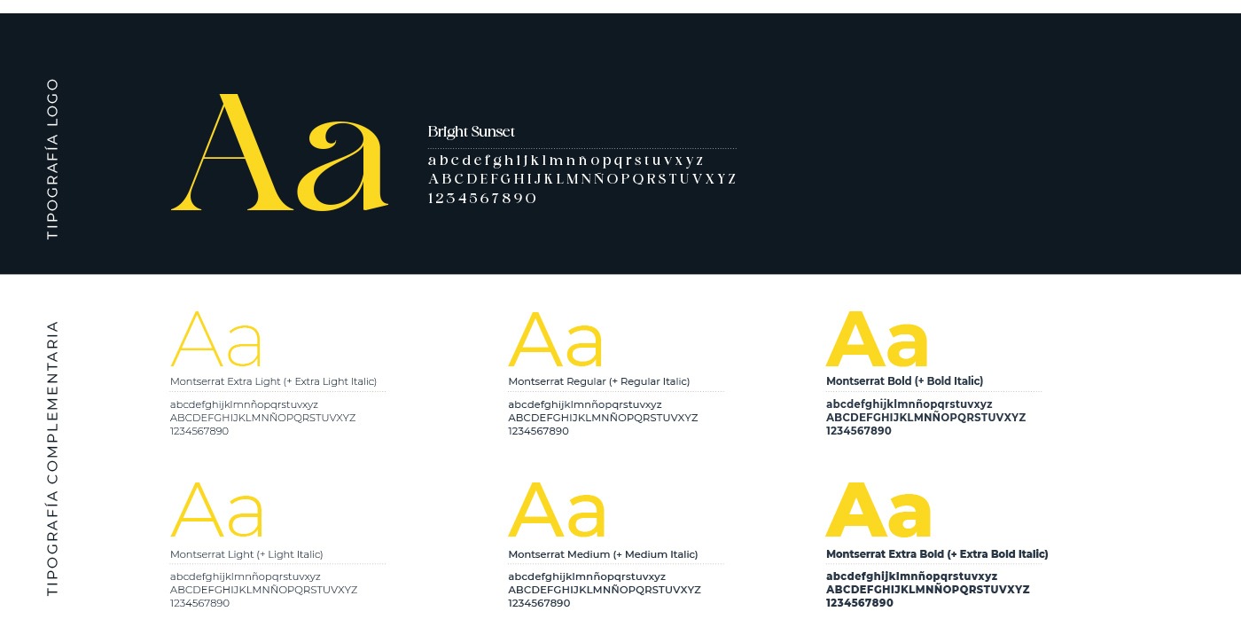
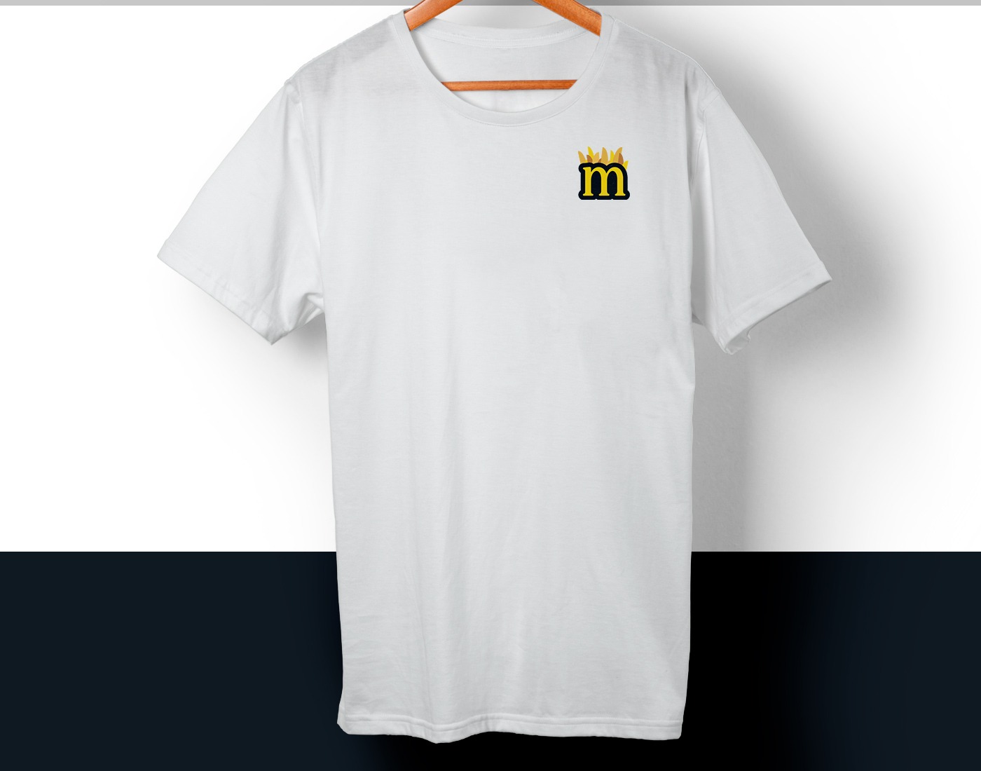
The logo for Malcriades reflects the bold and fun essence of the brand. We designed a serif typography with a thick outline, which adds character and visual presence. To make it even more special, we incorporated a unique detail: fries (cut into wedges) that protrude above the text, immediately communicating the essence of the business.
Colors That Open the Appetite
In the design of Malcriades, we selected a color palette that connects with appetite and the identity of the food truck:
- Yellow: Represents warmth, melted cheese, and crispy fries.
- Black: Adds a modern and elegant touch, enhancing the visual contrast in all brand elements.
Why This Design is Perfect for Malcriades
Our goal was to create branding that stands out in the competitive world of food trucks. The eye-catching and original design of the logo, along with the vibrant colors, ensures that Malcriades is memorable and easy to identify, attracting fry lovers from the very first glance.Moreover, the style of the logo and the color palette perfectly adapt to various communication formats, from posters to social media, ensuring a cohesive and effective brand presence.