A brochure that sells luxury without saying a word too many.
Essentially Mallorca · Like you have never imagined
I designed and laid out the 2016 brochure for Essentially Mallorca, a Palma de Mallorca company dedicated to promoting luxury experiences through its partners: hotels, nautical, transport, golf and unique experiences. The brief also included defining print specifications and liaising with the printer.
Luxury is communicated through silence, good paper and a typeface that knows how to wait.
Color e identidad.
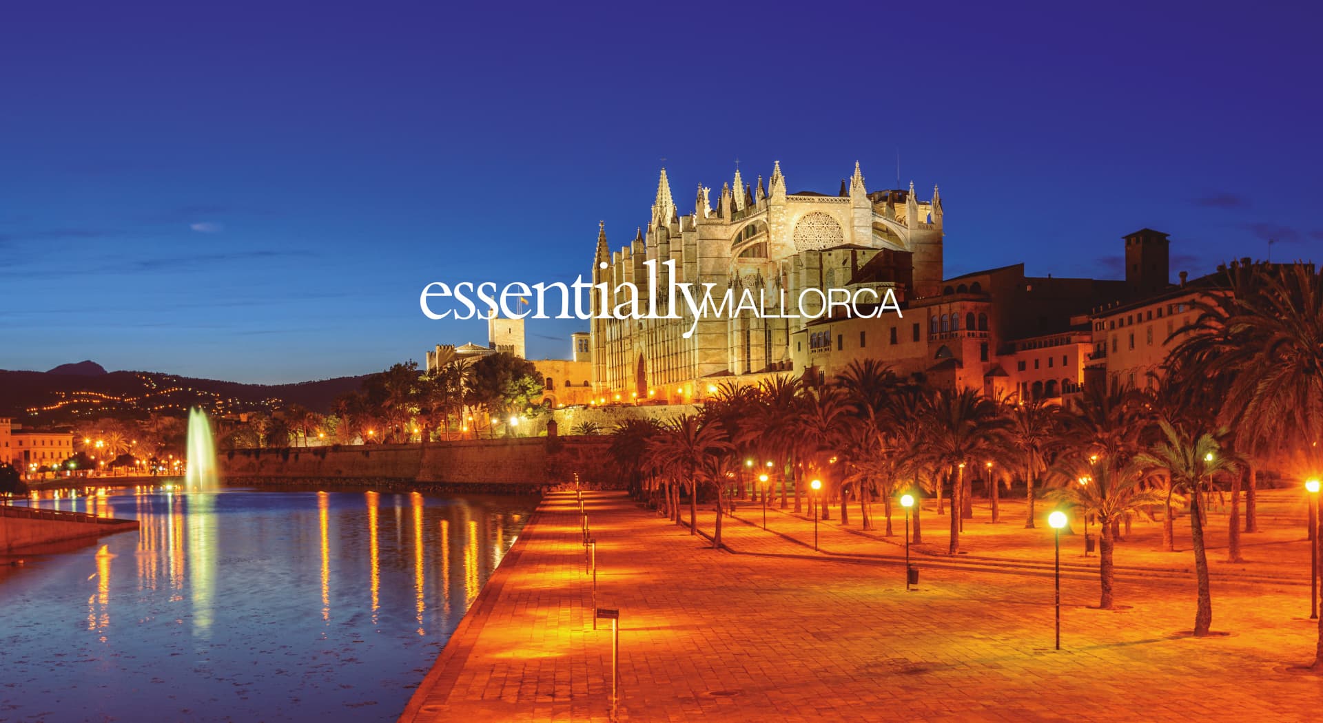
Deep night blues and warm golds, evoking Mallorca after dark, with the illuminated Cathedral as the opening image of an exclusive experience.
The Essentially Mallorca logotype combines an elegant script typeface for 'essentially' with a more sober uppercase version for 'Mallorca'. That contrast is what sustains the brand's balance between warmth and exclusivity.
Five sections, one single narrative of luxury
I laid out the brochure in five sections (hotels, nautical, transport, unique experiences and golf), making sure each partner had its own space without breaking the overall thread of exclusivity.
Folders, cards and merchandising
Besides the brochure, I designed A4 folders with a flap, cards and personalised merchandising, extending the same luxury visual identity to every physical brand material.
The 2016 brochure and its associated materials gave Essentially Mallorca a printed presence worthy of its partners' exclusivity, while also managing the full process with the printer.
Este proyecto forma parte de mis servicios de graphic design.