

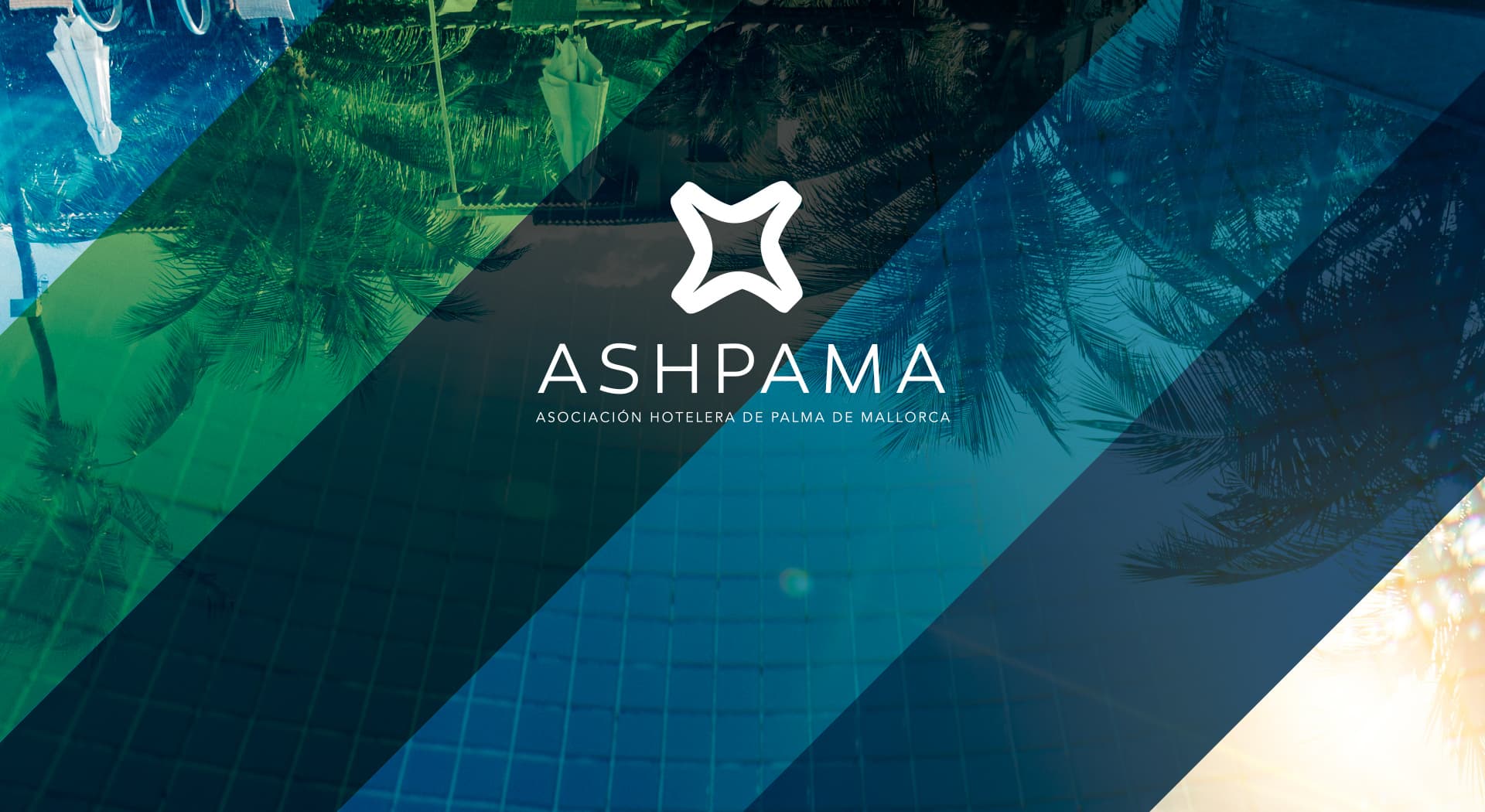
A single voice for 36 hotels and more than seven thousand beds.
ASHPAMA · Palma de Mallorca Hotel Association
I designed the corporate identity of ASHPAMA, the only city-hotel association in all of Mallorca, with 36 member establishments ranging from 2 to 5 stars. The image had to convey seriousness and modernity to represent a genuine hotel cluster.
An association of 36 hotels needs a symbol, not one more logotype.
Color e identidad.
Deep pool and Mediterranean-night blues, with gradients running from palm green to dark blue, against which the white of the symbol stands out sharply.
I designed a geometric symbol in the shape of a four-pointed star, halfway between a compass and a hotel star, paired with a sober uppercase typeface that reinforces the association's institutional seriousness.
A symbol between star and compass
The icon combines the idea of a hotel star with that of a compass guiding the sector: a single symbol to represent the 36 member hotels.
Materials to add value to the association
Beyond the logotype, I developed promotional graphic materials to communicate ASHPAMA's differential value as an accommodation cluster to members and institutions.
ASHPAMA now has a serious, modern image representing the entire city-hotel sector of Palma de Mallorca, reinforcing its role in improving the island's tourism competitiveness.
Este proyecto forma parte de mis servicios de brand identity.


