

Menus that taste of Port d'Andratx before the first bite.
Bar Central · Port d'Andratx
I designed the menu system (restaurant, drinks and cakes) for Bar Central, in Port d'Andratx, Mallorca. The texts are in Catalan, Spanish, English and German, with the mix of locals and tourists who fill the port in mind. The brief called for a warm, carefully finished image, able to accompany the venue's experience at every table.
A menu read with the same appetite it's ordered with.
Color e identidad.
A circular seal in anthracite grey, with a dotted border and the logotype in turquoise, marks the cover of every menu. Inside, a white base with geometric triangles in turquoise and grey leaves all the centre stage to the dishes and drinks.
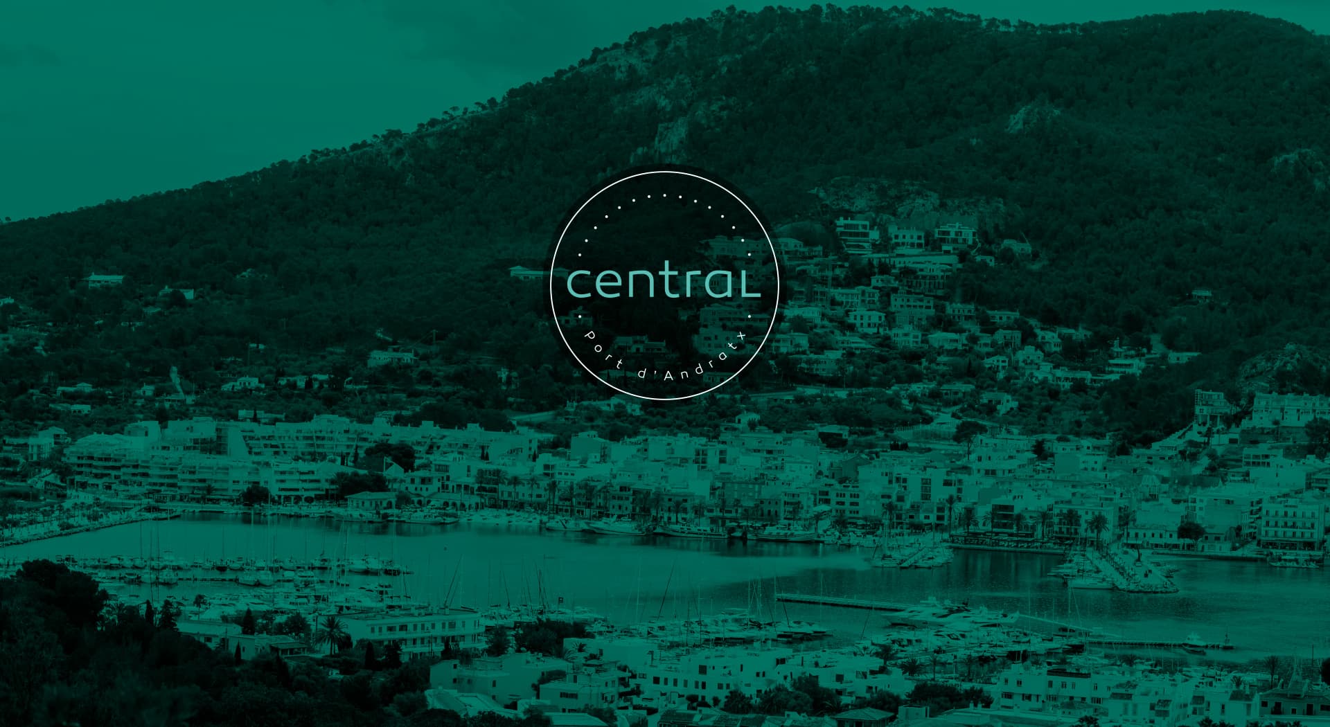
The logotype is a circular seal with a dotted border, 'central' in a rounded turquoise typeface and 'Port d'Andratx' in small caps below. I repeated the same graphic and typographic line across all three menus so customers recognise the Bar Central brand at any table.
A clear restaurant menu
I organised the dishes into easy-to-browse sections (continental, traditional, natural), with prices in turquoise and the four languages aligned in columns, so deciding is quick without losing the venue's warm tone.
Drinks and cakes, with the same identity
I extended the same graphic system (circular seal, turquoise and grey triangles, rounded typeface) to the drinks and cakes menus, so the visual coherence stands out at any table in Bar Central.
Bar Central in Port d'Andratx now has a coherent menu system in four languages, reinforcing the venue's identity on every visit from its customers.
Este proyecto forma parte de mis servicios de brand identity.


