

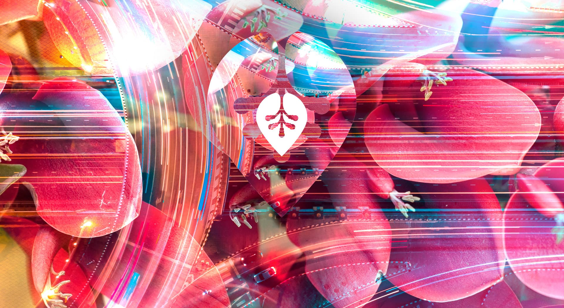
A brand with digital energy for a logistics company that moves fast.
Ceibo Group · Logistics in Palma de Mallorca
Ceibo Group is a logistics company based in Palma de Mallorca. I designed its logo aiming for an agile, contemporary image, away from the sector's more classic codes.
Logistics can also have an image with its own pulse and colour.
Color e identidad.
Intense reds and coral combined with white, reinforced by a header with digital textures in pink, cyan and magenta tones that bring movement and technology to the brand.
The symbol combines a stylised leaf inside a drop, like a location pin, with two strokes suggesting movement and connection. The condensed uppercase logotype conveys solidity, supported by the word 'Group' in a lighter weight.
A symbol with its own movement
The isotype, a stylised leaf inside that drop acting as a location pin, works as a recognisable brand seal even at small sizes, ideal for use on fleets and uniforms.
Applied to corporate stationery
I carried the identity over to the company's stationery, keeping the contrast between corporate red and white so the brand is recognised at a glance on any medium.
Ceibo Group now has an agile, distinctive visual identity to position itself in Mallorca's logistics sector.
Este proyecto forma parte de mis servicios de brand identity.


