

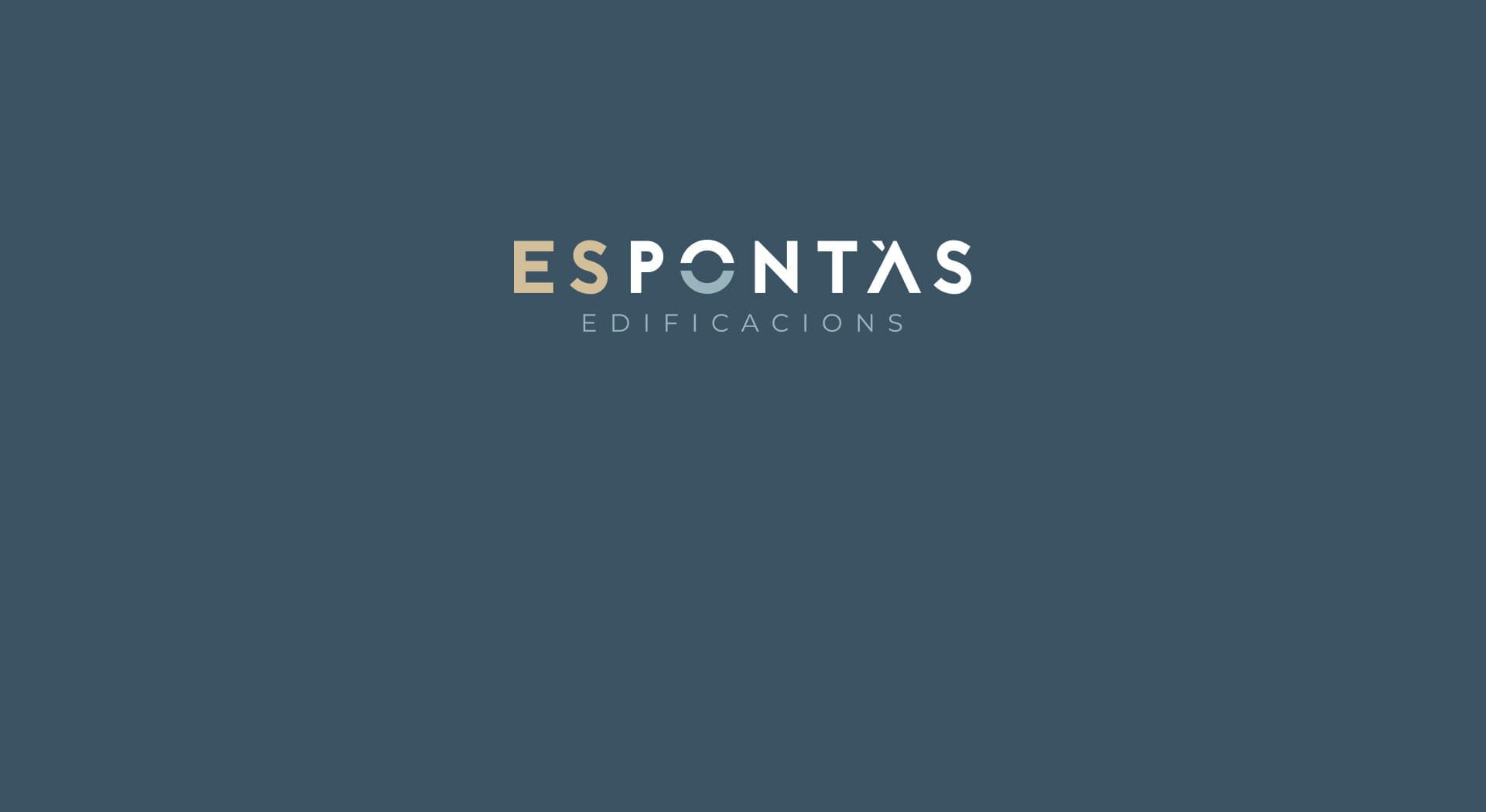
A natural arch turned into a brand symbol.
Es Pontàs · Edificaciones
Es Pontàs Edificaciones is a Mallorcan family business based in Santanyí, with over 50 years of experience in the construction sector. I redesigned its corporate identity taking as reference the well-known natural arch of Es Pontàs, in south-eastern Mallorca.
A stone arch in the sea, reduced to its simplest expression.
Color e identidad.
Deep blue-grey combined with aged gold, a sober palette conveying the solidity of over five decades of family history in construction.
The symbol starts from the letter 'o' split in half: the top half represents the natural arch of Es Pontàs and the bottom half its reflection in the sea, resolving in a single stroke the essence of the company and the landscape that gives it its name.
An arch reduced to its simplest expression
The split 'o' in the logo condenses the natural arch of Es Pontàs and its reflection in the sea into a single stroke, turning an element of the landscape into the company's visual signature.
Over 50 years of family history
I applied the new identity to the company's communications, looking for a modern image that, without losing solidity, would convey the family's more than five decades of experience in construction.
Es Pontàs Edificaciones has a modern identity rooted in the landscape around it, consistent with its family history.
Este proyecto forma parte de mis servicios de brand identity.


