

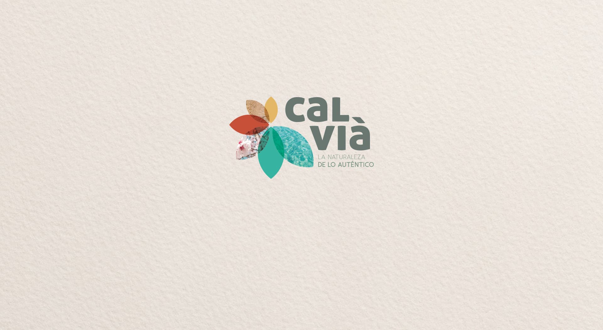
A logo that turns Calvià's landscape into a tourism brand.
Fundación Calvià · Tourism and nature
Logo, tagline and information brochure proposal to attract tourism to the municipality of Calvià. The brief asked to condense the values of a highly diverse territory, coast, mountains and countryside, into a single image.
The nature of what's authentic, turned into a symbol.
Color e identidad.
A muted colour palette that translates Calvià's landscape into feelings: orange for the sand and sandstone, red for the mountains and flowers, green for the turquoise water and the countryside.
The logo takes the shape of a flower whose petals hide references to the territory. Splitting the name across two lines adds compactness and impact, and a modern, sturdy typeface for the main word is combined with a thin version for the tagline, creating a balanced contrast.
A flower with meaning
Each petal in the logo refers to one of the municipality's core values. It's an image that looks simple, but is packed with meaning underneath.
Versatility on any surface
The compact look of the logo plus tagline gives it the freedom to adapt to any format, from the information brochure to the municipality's signage.
Fundación Calvià now has an identity that sums up its territory in a single image: warm, relaxing and strong enough to work as a tourism draw in brochures and informational materials.
Este proyecto forma parte de mis servicios de brand identity.


