

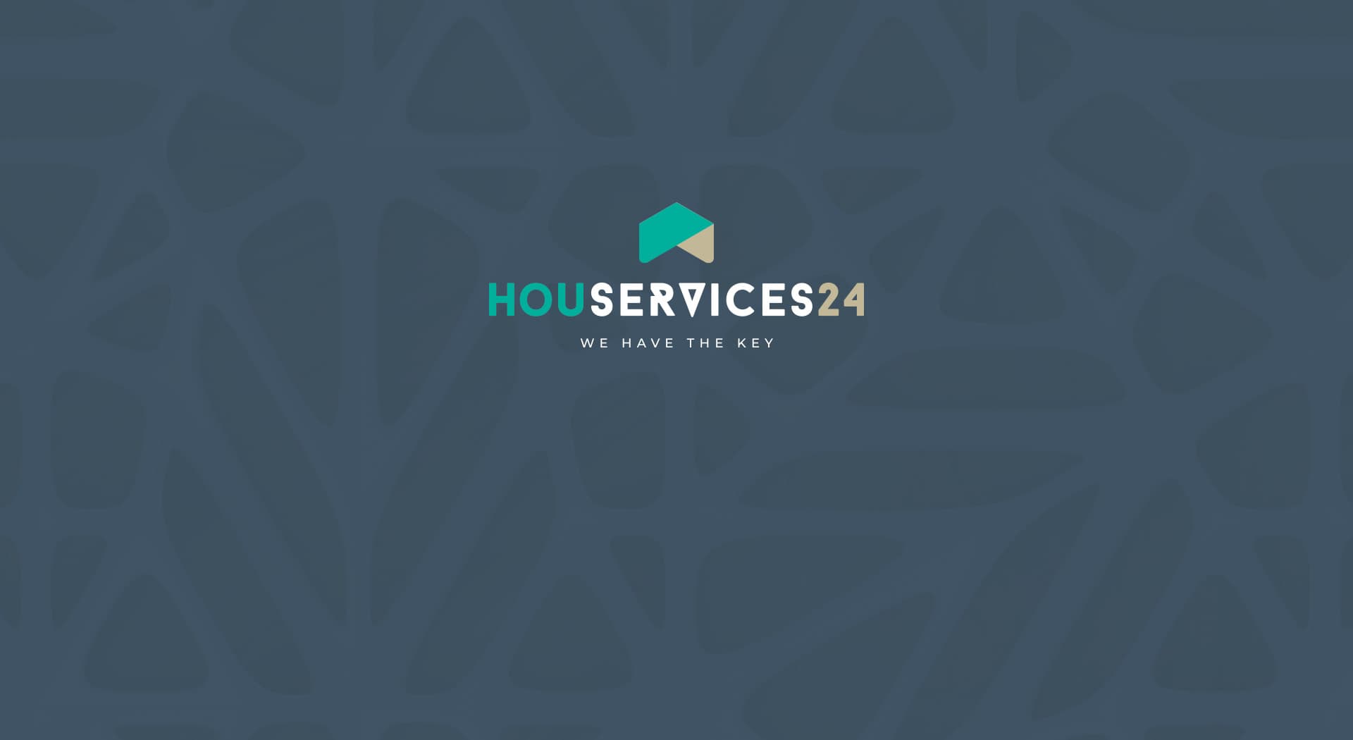
"We have the key": an identity that conveys total availability.
Houservices24 · We have the key
Houservices24 is a home services company based in Palma de Mallorca. I designed its brand from scratch, along with the corporate stationery and graphic materials it needed, built to work both digitally and on physical formats.
Always having the key at hand starts with having a brand you can trust.
Color e identidad.
Dark petrol blue combined with turquoise and sand beige, a sober, direct palette chosen to convey security and availability, easy to recognize on any format.
The icon, a two-tone roof that also evokes a key, precedes a three-colour wordmark: HOU in turquoise, SERVICES in petrol blue and 24 in beige. A clear, functional logo, built to work just as well on a card as on a sign.
A consistent brand system
I defined a complete identity system, with positive and negative versions of the logo and clear usage rules so that the logo and its variants stayed consistent in any application.
Graphic materials for everyday use
I developed the graphic materials the company needed for its daily operations (corporate stationery, email signature and presentation folder), following the same visual line defined in the identity.
Houservices24, based in Palma de Mallorca, now has a solid identity and a consistent set of graphic materials that reinforce its promise of reliable, available service.
Este proyecto forma parte de mis servicios de brand identity.


