

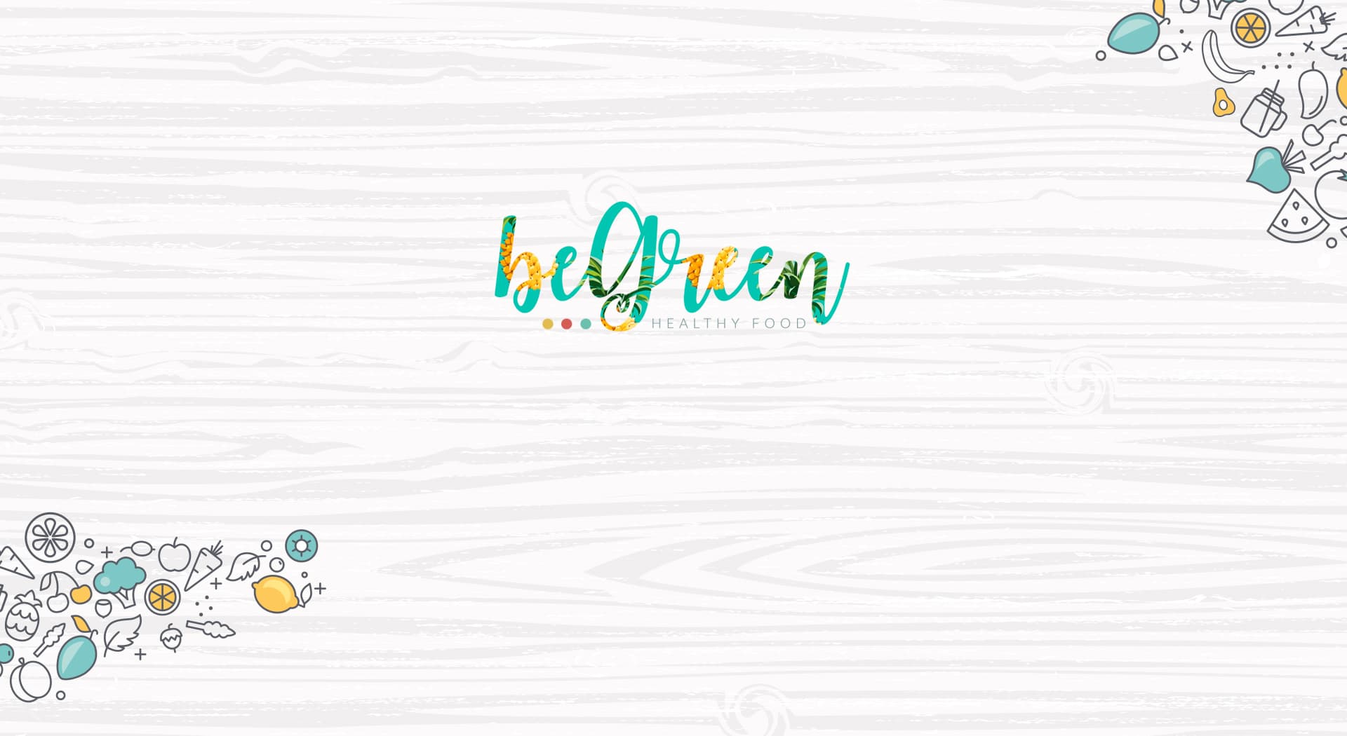
Natural freshness in every stroke of a logo.
Be Green · Healthy food, Santa Ponça
Be Green is a healthy-food stand in Santa Ponça, Mallorca, with fresh, 100% natural products made daily. I designed its corporate identity and website to convey naturalness and freshness at first glance.
Eating healthy can also come with a brand that has flavour.
Color e identidad.
Vegetable greens and citrus oranges over a light-wood-textured white background, accompanied by linear illustrations of fruits and vegetables that reinforce the idea of fresh produce.
The logo combines a green and orange script typeface with small coloured dots resembling a signature, topped by a leaf icon that sums up the idea of natural food in a single stroke.
Illustration to reinforce the natural feel
I paired the logo with linear illustrations of fruits and vegetables, a graphic device that reinforces the message of fresh, daily-made produce.
Graphic materials and website
I developed promotional graphic materials and the Be Green website, applying the same fresh, natural visual language to every format.
Be Green now has a fresh, natural image that communicates its healthy-food proposition, consistent across its identity, graphic materials and website.
Este proyecto forma parte de mis servicios de brand identity.


