

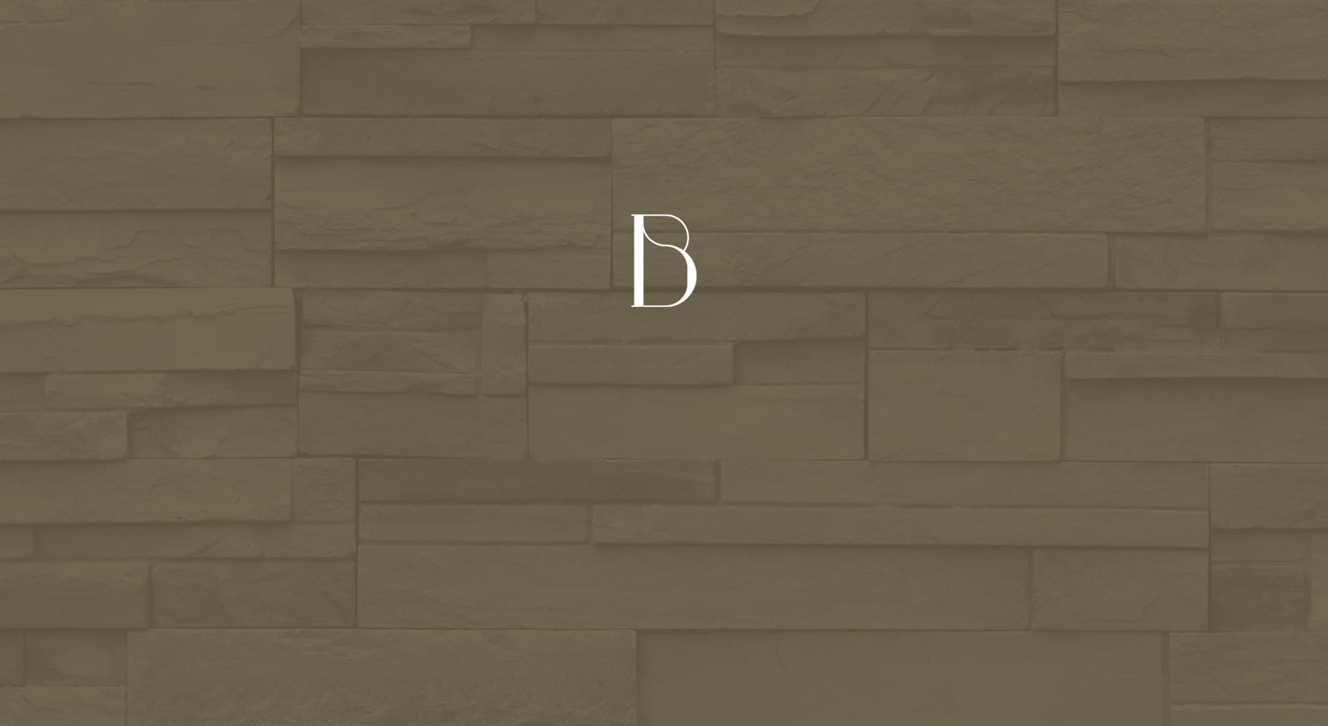
A logo with the warmth of Mallorcan stone for a new residential development.
Na Bordissot · Bonet Moreno
Bonet Moreno commissioned me to design the logo for Na Bordissot, their new residential development. A name of its own for a project that needed a sober, characterful image from the very first glance.
A development with a name of its own needs a mark that's remembered.
Color e identidad.
Earthy and beige tones recalling Mallorcan stone and façades, with the logo resolved in white and in a greyish brown to work on both backgrounds.
The logo rests on a stylised serif typeface, with NA in small caps above BORDISSOT and a marked contrast between fine and bold strokes that gives it personality without losing the sobriety a residential development calls for.
A brand that works on any background
I resolved the logo in several colour versions so it kept its legibility on both stationery and digital media, without losing its warm, handcrafted character.
Consistent digital presence
The brand also carries over into the development's online presentation, with the same warm palette and typeface applied over the mood images accompanying the marketing.
Bonet Moreno now has a sober, recognisable brand image to present Na Bordissot, ready to accompany the marketing of the development.
Este proyecto forma parte de mis servicios de brand identity.


