

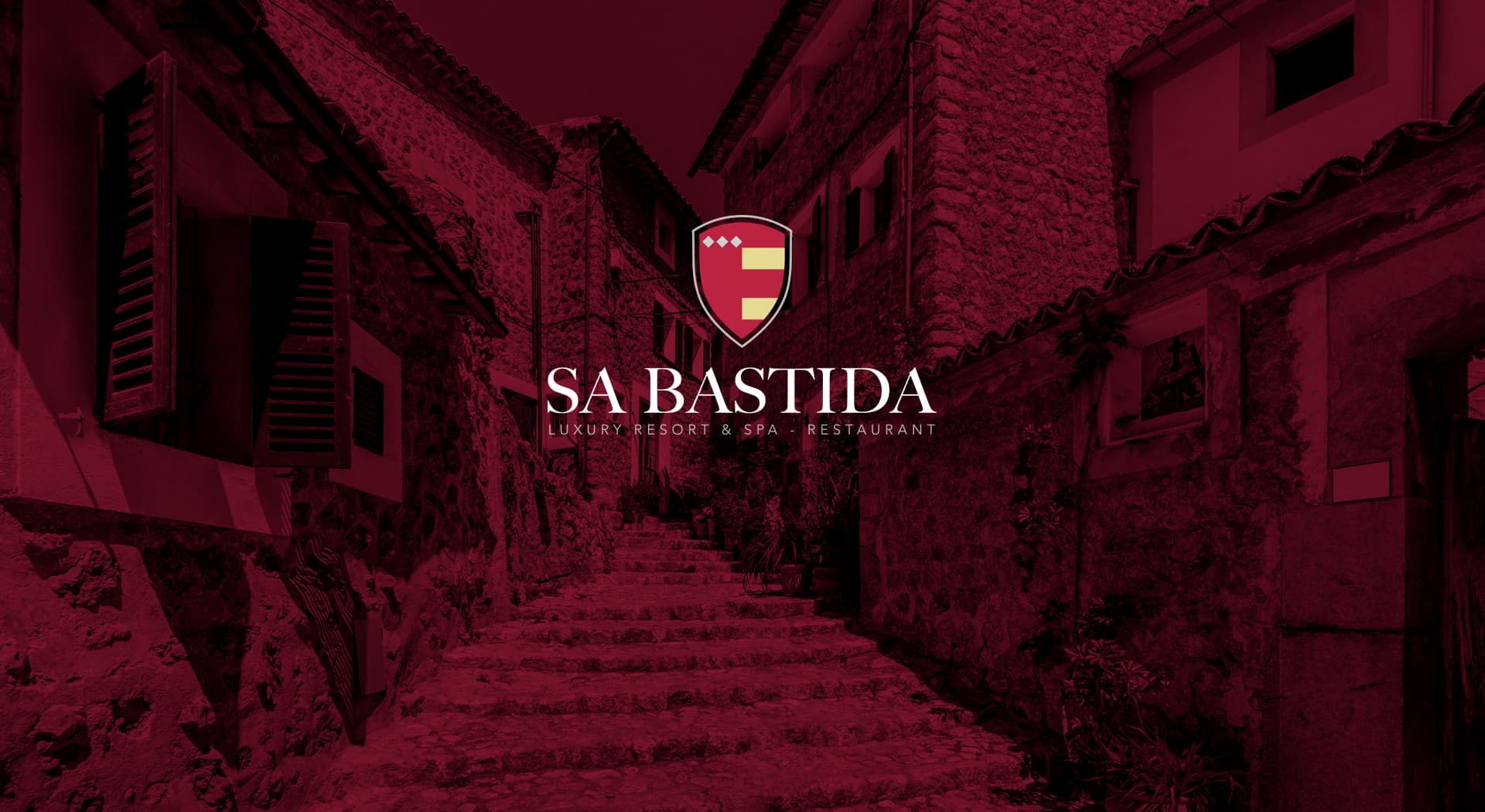
A family crest turned into a luxury brand.
Sa Bastida · Luxury Resort & Spa - Restaurant
Corporate identity design for Sa Bastida, Luxury Resort & Spa - Restaurant. The brief was a rebrand that had to convey history, tradition and luxury, while preserving the family crest as the core of the new brand.
A family's crest, with the pulse of a luxury resort.
Color e identidad.
A sober palette of earthy tones and aged golds, evoking ancient stone and fine timber: the same visual language of the estate that gives the resort its name.
I kept the family crest as the core of the brand and built it into a classic, elegant typographic system, able to coexist with the resort's historic architecture and the sophistication expected of its restaurant and spa.
The crest, a guiding thread
I respected the family crest as the identifying element and gave it prominence within a more refined brand construction, without losing the historical weight that makes it unique.
A system for resort, spa and restaurant
I developed brand variants for the different business areas (resort, spa and restaurant), keeping a shared visual root that unifies the whole guest experience.
Sa Bastida now has an identity that honours its family history while communicating the level of luxury and tradition promised by its resort, spa and restaurant.
Este proyecto forma parte de mis servicios de brand identity.


