

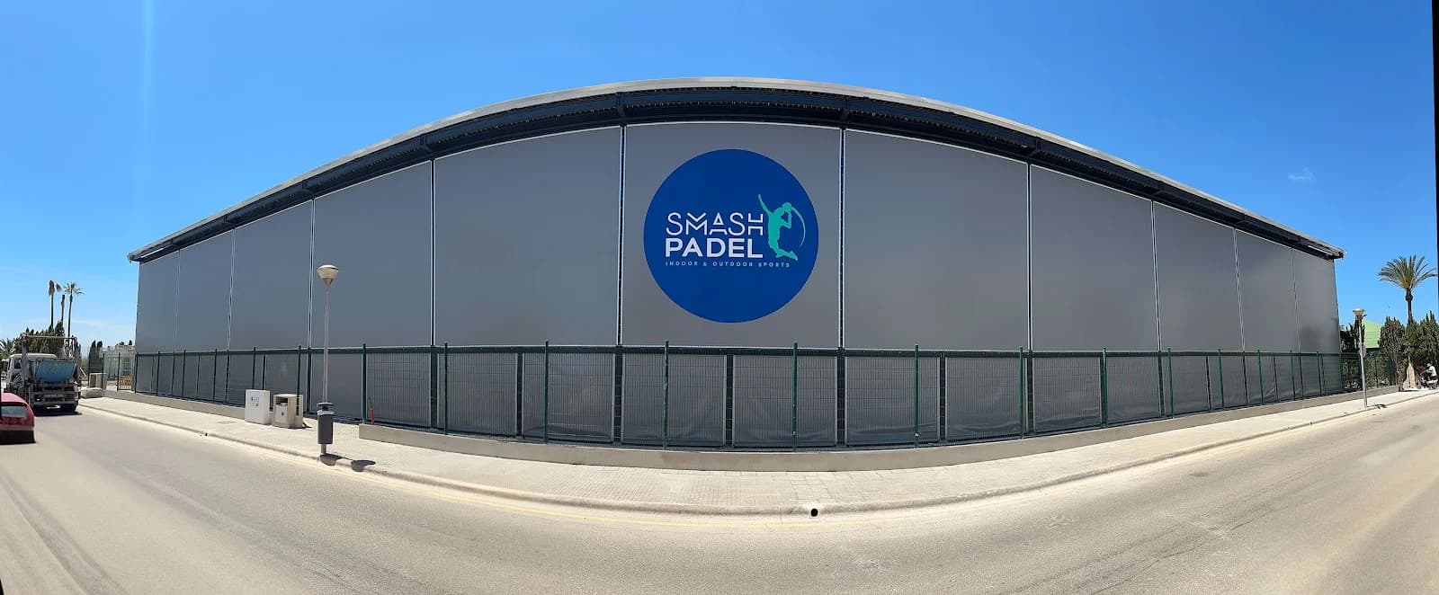
The gesture of a padel smash turned into a logotype with its own energy.
Smash Padel · Sports Centre
Smash Padel is a padel sports centre for which I developed, together with agencies GLight and Sixdarts, a visual identity that combines modern typography with the silhouette of a player finishing a smash.
The instant of the smash, frozen into a symbol.
Color e identidad.
Navy blue, which brings calm and stability, combined with turquoise, which brings freshness and dynamism.
The symbol depicts a player executing a padel smash, integrated with a dual-style typeface that combines energy and modernity.
The smash as an icon
The smash gesture becomes the central graphic element, a direct and recognisable nod to the sport's most characteristic action.
A palette designed to convey energy
Navy blue and turquoise run through the whole identity to reinforce the sense of dynamism, passion and freshness of the centre.
Smash Padel now has a unique, recognisable visual identity that conveys the passion and energy of the sport.
Este proyecto forma parte de mis servicios de brand identity.


