

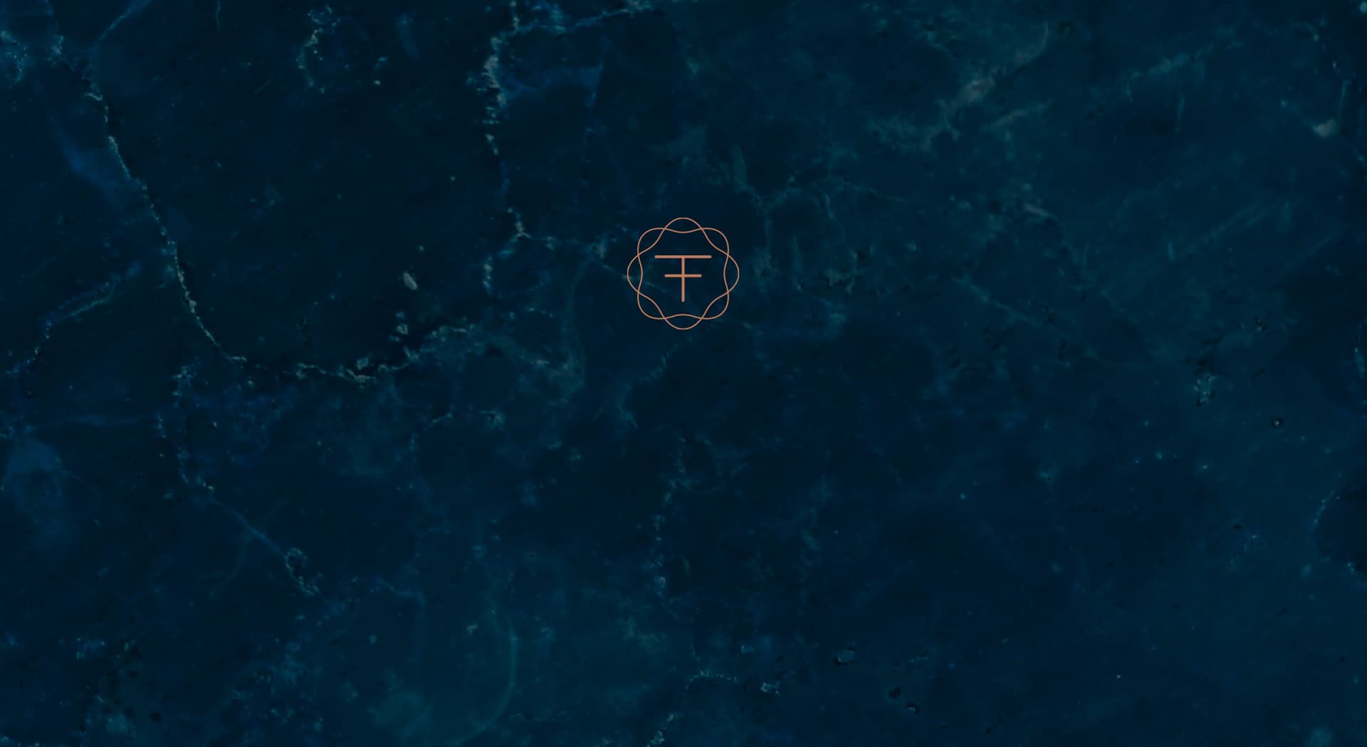
A logotype that aligns technology and luxury for a high-standing audience.
Teraflow Group · Technology consulting
Teraflow Group helps companies align their technology strategy with the organisation's value. The client asked for a brand that conveyed modernity and luxury, designed for a demanding, high-level audience.
Technology also needs a visual language worthy of its clients.
Color e identidad.
Bluish black and ivory white, with a copper accent that provides the distinctive touch of the premium technology sector. In the brand presentation I combined it with marble textures, in white and black, to reinforce the idea of luxury.
The symbol fuses the initials T and F within a fine-lined, almost ornamental circular motif that wraps the monogram like a seal. The logotype's typeface, light and with a W split into two strokes, provides the touch of modernity the client asked for without losing the solidity expected of a consultancy.
A monogram with the air of a seal
I drew the TF symbol within a fine-lined circular motif, almost like a filigree, taking care with the proportions so it would work equally well in a corporate dossier as on a business card.
Marble and copper for a demanding audience
I presented the identity over black and white marble textures, with the logotype's copper accent as a connecting thread, to confirm it kept its modern, luxurious character in any application.
Teraflow Group now has a sober visual identity combining the circular monogram, the light typeface and marble-and-copper finishes, coherent with its positioning as a technology consultancy aimed at a high-standing audience.
Este proyecto forma parte de mis servicios de brand identity.


