

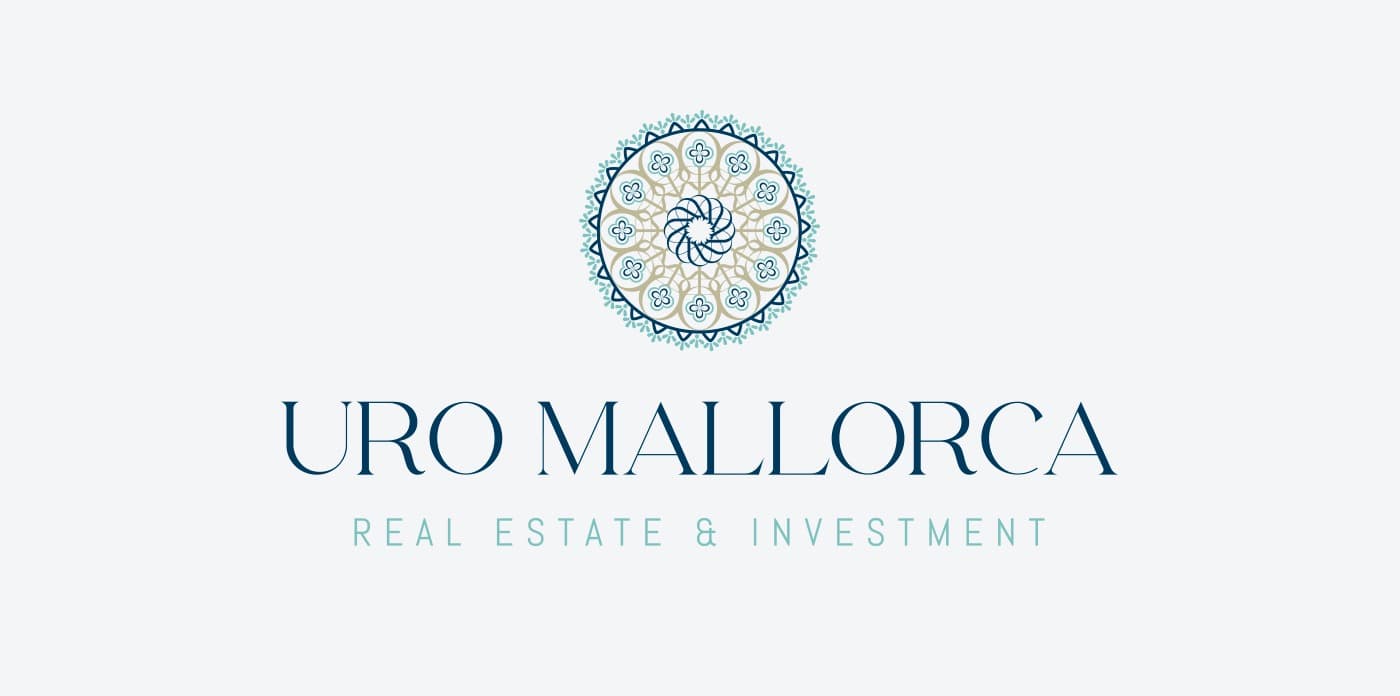
The Cathedral's rose window turned into a real-estate symbol.
URO Mallorca · Real Estate & Investment
URO Mallorca is a real estate and investment firm that wanted an identity able to convey luxury, professionalism and a close connection to the island. I designed its branding drawing on Mallorca's architectural and Mediterranean essence.
Luxury is also inherited from an island's stone and light.
Color e identidad.
Turquoise inspired by the Mediterranean sea, navy blue that brings depth and professionalism, and soft earth tones that evoke the island's typical marés sandstone.
The symbol is inspired by the rose window of Mallorca Cathedral: the letters U, R and O intertwine to form it, surrounded by a sun representing the light and warmth of the Mediterranean. The serif typeface, with fine, elegant lines, reinforces the brand's premium identity.
Tradition and modernity intertwined
I designed a symbol that fuses an architectural icon of Mallorca with the brand's initials. The result is an elegant, sophisticated logotype, fitting for the luxury real-estate sector the firm operates in.
A chromatic tribute to the Mediterranean
I extended the palette of turquoises, navy blues and earth tones to every brand application, so URO Mallorca's connection to the island would be felt in every piece, not only in the symbol.
URO Mallorca now has branding that communicates luxury and professionalism, with the direct connection to the island it sought from the start. Today it is a benchmark in real estate and investment in Mallorca.
Este proyecto forma parte de mis servicios de brand identity.


